
Download Lectures on Biostatistics (1971). Corrected and searchable version of Google books edition
Download review of Lectures on Biostatistics (THES, 1973).
random
|
“Statistical regression to the mean predicts that patients selected for abnormalcy will, on the average, tend to improve. We argue that most improvements attributed to the placebo effect are actually instances of statistical regression.”
“Thus, we urge caution in interpreting patient improvements as causal effects of our actions and should avoid the conceit of assuming that our personal presence has strong healing powers.” |
In 1955, Henry Beecher published "The Powerful Placebo". I was in my second undergraduate year when it appeared. And for many decades after that I took it literally, They looked at 15 studies and found that an average 35% of them got "satisfactory relief" when given a placebo. This number got embedded in pharmacological folk-lore. He also mentioned that the relief provided by placebo was greatest in patients who were most ill.
Consider the common experiment in which a new treatment is compared with a placebo, in a double-blind randomised controlled trial (RCT). It’s common to call the responses measured in the placebo group the placebo response. But that is very misleading, and here’s why.
The responses seen in the group of patients that are treated with placebo arise from two quite different processes. One is the genuine psychosomatic placebo effect. This effect gives genuine (though small) benefit to the patient. The other contribution comes from the get-better-anyway effect. This is a statistical artefact and it provides no benefit whatsoever to patients. There is now increasing evidence that the latter effect is much bigger than the former.
How can you distinguish between real placebo effects and get-better-anyway effect?
The only way to measure the size of genuine placebo effects is to compare in an RCT the effect of a dummy treatment with the effect of no treatment at all. Most trials don’t have a no-treatment arm, but enough do that estimates can be made. For example, a Cochrane review by Hróbjartsson & Gøtzsche (2010) looked at a wide variety of clinical conditions. Their conclusion was:
“We did not find that placebo interventions have important clinical effects in general. However, in certain settings placebo interventions can influence patient-reported outcomes, especially pain and nausea, though it is difficult to distinguish patient-reported effects of placebo from biased reporting.”
In some cases, the placebo effect is barely there at all. In a non-blind comparison of acupuncture and no acupuncture, the responses were essentially indistinguishable (despite what the authors and the journal said). See "Acupuncturists show that acupuncture doesn’t work, but conclude the opposite"
So the placebo effect, though a real phenomenon, seems to be quite small. In most cases it is so small that it would be barely perceptible to most patients. Most of the reason why so many people think that medicines work when they don’t isn’t a result of the placebo response, but it’s the result of a statistical artefact.
Regression to the mean is a potent source of deception
The get-better-anyway effect has a technical name, regression to the mean. It has been understood since Francis Galton described it in 1886 (see Senn, 2011 for the history). It is a statistical phenomenon, and it can be treated mathematically (see references, below). But when you think about it, it’s simply common sense.
You tend to go for treatment when your condition is bad, and when you are at your worst, then a bit later you’re likely to be better, The great biologist, Peter Medawar comments thus.
|
"If a person is (a) poorly, (b) receives treatment intended to make him better, and (c) gets better, then no power of reasoning known to medical science can convince him that it may not have been the treatment that restored his health"
(Medawar, P.B. (1969:19). The Art of the Soluble: Creativity and originality in science. Penguin Books: Harmondsworth). |
This is illustrated beautifully by measurements made by McGorry et al., (2001). Patients with low back pain recorded their pain (on a 10 point scale) every day for 5 months (they were allowed to take analgesics ad lib).
The results for four patients are shown in their Figure 2. On average they stay fairly constant over five months, but they fluctuate enormously, with different patterns for each patient. Painful episodes that last for 2 to 9 days are interspersed with periods of lower pain or none at all. It is very obvious that if these patients had gone for treatment at the peak of their pain, then a while later they would feel better, even if they were not actually treated. And if they had been treated, the treatment would have been declared a success, despite the fact that the patient derived no benefit whatsoever from it. This entirely artefactual benefit would be the biggest for the patients that fluctuate the most (e.g this in panels a and d of the Figure).
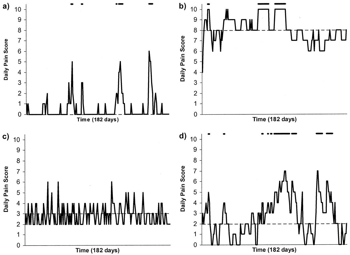
Figure 2 from McGorry et al, 2000. Examples of daily pain scores over a 6-month period for four participants. Note: Dashes of different lengths at the top of a figure designate an episode and its duration.
The effect is illustrated well by an analysis of 118 trials of treatments for non-specific low back pain (NSLBP), by Artus et al., (2010). The time course of pain (rated on a 100 point visual analogue pain scale) is shown in their Figure 2. There is a modest improvement in pain over a few weeks, but this happens regardless of what treatment is given, including no treatment whatsoever.
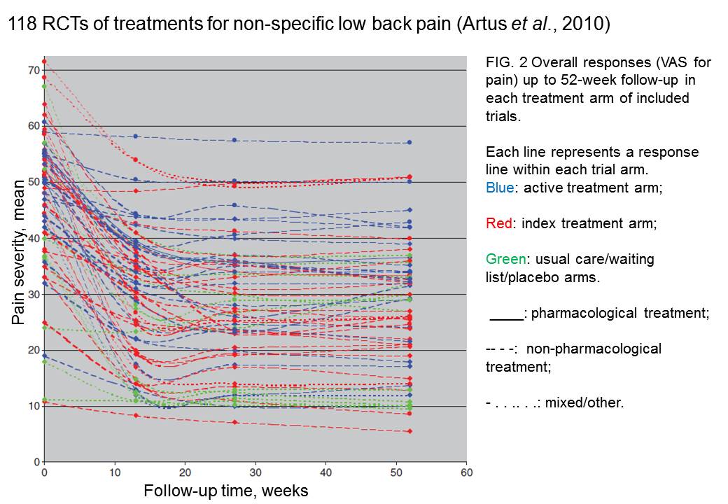
FIG. 2 Overall responses (VAS for pain) up to 52-week follow-up in each treatment arm of included trials. Each line represents a response line within each trial arm. Red: index treatment arm; Blue: active treatment arm; Green: usual care/waiting list/placebo arms. ____: pharmacological treatment; – – – -: non-pharmacological treatment; . . .. . .: mixed/other.
The authors comment
"symptoms seem to improve in a similar pattern in clinical trials following a wide variety of active as well as inactive treatments.", and "The common pattern of responses could, for a large part, be explained by the natural history of NSLBP".
In other words, none of the treatments work.
This paper was brought to my attention through the blog run by the excellent physiotherapist, Neil O’Connell. He comments
"If this finding is supported by future studies it might suggest that we can’t even claim victory through the non-specific effects of our interventions such as care, attention and placebo. People enrolled in trials for back pain may improve whatever you do. This is probably explained by the fact that patients enrol in a trial when their pain is at its worst which raises the murky spectre of regression to the mean and the beautiful phenomenon of natural recovery."
O’Connell has discussed the matter in recent paper, O’Connell (2015), from the point of view of manipulative therapies. That’s an area where there has been resistance to doing proper RCTs, with many people saying that it’s better to look at “real world” outcomes. This usually means that you look at how a patient changes after treatment. The hazards of this procedure are obvious from Artus et al.,Fig 2, above. It maximises the risk of being deceived by regression to the mean. As O’Connell commented
"Within-patient change in outcome might tell us how much an individual’s condition improved, but it does not tell us how much of this improvement was due to treatment."
In order to eliminate this effect it’s essential to do a proper RCT with control and treatment groups tested in parallel. When that’s done the control group shows the same regression to the mean as the treatment group. and any additional response in the latter can confidently attributed to the treatment. Anything short of that is whistling in the wind.
Needless to say, the suboptimal methods are most popular in areas where real effectiveness is small or non-existent. This, sad to say, includes low back pain. It also includes just about every treatment that comes under the heading of alternative medicine. Although these problems have been understood for over a century, it remains true that
|
"It is difficult to get a man to understand something, when his salary depends upon his not understanding it."
Upton Sinclair (1935) |
Responders and non-responders?
One excuse that’s commonly used when a treatment shows only a small effect in proper RCTs is to assert that the treatment actually has a good effect, but only in a subgroup of patients ("responders") while others don’t respond at all ("non-responders"). For example, this argument is often used in studies of anti-depressants and of manipulative therapies. And it’s universal in alternative medicine.
There’s a striking similarity between the narrative used by homeopaths and those who are struggling to treat depression. The pill may not work for many weeks. If the first sort of pill doesn’t work try another sort. You may get worse before you get better. One is reminded, inexorably, of Voltaire’s aphorism "The art of medicine consists in amusing the patient while nature cures the disease".
There is only a handful of cases in which a clear distinction can be made between responders and non-responders. Most often what’s observed is a smear of different responses to the same treatment -and the greater the variability, the greater is the chance of being deceived by regression to the mean.
For example, Thase et al., (2011) looked at responses to escitalopram, an SSRI antidepressant. They attempted to divide patients into responders and non-responders. An example (Fig 1a in their paper) is shown.
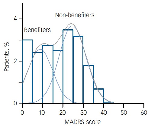
The evidence for such a bimodal distribution is certainly very far from obvious. The observations are just smeared out. Nonetheless, the authors conclude
"Our findings indicate that what appears to be a modest effect in the grouped data – on the boundary of clinical significance, as suggested above – is actually a very large effect for a subset of patients who benefited more from escitalopram than from placebo treatment. "
I guess that interpretation could be right, but it seems more likely to be a marketing tool. Before you read the paper, check the authors’ conflicts of interest.
The bottom line is that analyses that divide patients into responders and non-responders are reliable only if that can be done before the trial starts. Retrospective analyses are unreliable and unconvincing.
Some more reading
Senn, 2011 provides an excellent introduction (and some interesting history). The subtitle is
"Here Stephen Senn examines one of Galton’s most important statistical legacies – one that is at once so trivial that it is blindingly obvious, and so deep that many scientists spend their whole career being fooled by it."
The examples in this paper are extended in Senn (2009), “Three things that every medical writer should know about statistics”. The three things are regression to the mean, the error of the transposed conditional and individual response.
You can read slightly more technical accounts of regression to the mean in McDonald & Mazzuca (1983) "How much of the placebo effect is statistical regression" (two quotations from this paper opened this post), and in Stephen Senn (2015) "Mastering variation: variance components and personalised medicine". In 1988 Senn published some corrections to the maths in McDonald (1983).
The trials that were used by Hróbjartsson & Gøtzsche (2010) to investigate the comparison between placebo and no treatment were looked at again by Howick et al., (2013), who found that in many of them the difference between treatment and placebo was also small. Most of the treatments did not work very well.
Regression to the mean is not just a medical deceiver: it’s everywhere
Although this post has concentrated on deception in medicine, it’s worth noting that the phenomenon of regression to the mean can cause wrong inferences in almost any area where you look at change from baseline. A classical example concern concerns the effectiveness of speed cameras. They tend to be installed after a spate of accidents, and if the accident rate is particularly high in one year it is likely to be lower the next year, regardless of whether a camera had been installed or not. To find the true reduction in accidents caused by installation of speed cameras, you would need to choose several similar sites and allocate them at random to have a camera or no camera. As in clinical trials. looking at the change from baseline can be very deceptive.
Statistical postscript
Lastly, remember that it you avoid all of these hazards of interpretation, and your test of significance gives P = 0.047. that does not mean you have discovered something. There is still a risk of at least 30% that your ‘positive’ result is a false positive. This is explained in Colquhoun (2014),"An investigation of the false discovery rate and the misinterpretation of p-values". I’ve suggested that one way to solve this problem is to use different words to describe P values: something like this.
|
P > 0.05 very weak evidence
P = 0.05 weak evidence: worth another look P = 0.01 moderate evidence for a real effect P = 0.001 strong evidence for real effect |
But notice that if your hypothesis is implausible, even these criteria are too weak. For example, if the treatment and placebo are identical (as would be the case if the treatment were a homeopathic pill) then it follows that 100% of positive tests are false positives.
Follow-up
12 December 2015
It’s worth mentioning that the question of responders versus non-responders is closely-related to the classical topic of bioassays that use quantal responses. In that field it was assumed that each participant had an individual effective dose (IED). That’s reasonable for the old-fashioned LD50 toxicity test: every animal will die after a sufficiently big dose. It’s less obviously right for ED50 (effective dose in 50% of individuals). The distribution of IEDs is critical, but it has very rarely been determined. The cumulative form of this distribution is what determines the shape of the dose-response curve for fraction of responders as a function of dose. Linearisation of this curve, by means of the probit transformation used to be a staple of biological assay. This topic is discussed in Chapter 10 of Lectures on Biostatistics. And you can read some of the history on my blog about Some pharmacological history: an exam from 1959.
This is a post about Markovian queuing theory. But hang on, don’t run away. It isn’t so hard.
|
The idea came from my recent experience. On Friday 23 October, I was supposed to have a kidney removed at the Royal Marsden Hospital. At the very last minute the operation was cancelled. That is more irritating than serious. A delay of a few weeks poses no great risk for me. . |

|
The cancellation arose because there was no bed available in the High Dependency Unit (HDU), which is where nephrectomy patients go for a while after the operation. Was this a failure of the NHS? I think not and here’s why
The first reaction of a neighbour to this news was to say "that’s why I have private insurance". Well, wrong actually. For a start, at the Marsden private patients and NHS patients get identical treatment (the only difference on the NHS is that "you don’t get hot and cold running margaritas at your bedside", my surgeon said). And secondly, the provision of emergency beds poses a really difficult problem, which I’ll attempt to explain.
Bed provision raises a fascinating statistical question. How many beds must be available to make sure nobody is ever turned away? The answer, in principle, is an infinite number. In practice it is more than anyone can afford.
The HDU has eleven beds but let’s think about a simpler case to start with. If patients arrived regularly at a fixed rate, and each patient stayed for a fixed length of time. there would be no problem. Say, for example, that a patient arrived regularly at 10 am and 4 pm each day, and suppose that each patient stayed for exactly 46 hours. It’s pretty obvious that you’d need four beds. Each bed could take a patient every two days and there are two patients per day coming in. Allowing two hours for changing beds, all four beds would be occupied for essentially 100 percent of the time, actually 95% = 46 hours/48 hours).
Random arrivals
The problem arises because patients don’t arrive regularly and they don’t stay for a fixed length of time. What happens if patients arrive at random and stay for a random length of time? (We’ll get back to the meaning of ‘random’ in this context later.)
Suppose again that two patients per day arrive on average, and that each patient stays in the HDU for 46 hours on average. So the mean arrival rate, and the mean length of stay in the HDU are the same as in the first example. When there was no randomness, four beds coped perfectly.
But with random arrivals and random length of stay the situation is very different. With four beds, if a queue were allowed to build up, the average number of patients in the queue would be 21 and the average length of time a patient would spend waiting to get a bed would be 10.5 days. This would be an efficient use of resources because every time a bed was vacated it would be filled straight away from the queue. The resources would be used to the maximum possible extent:, 95%. But it would be terrible for patients. The length of the queue would, of course, fluctuate, as shown by this distribution (see below) of the queue length. Occasionally it might reach 100 or more.
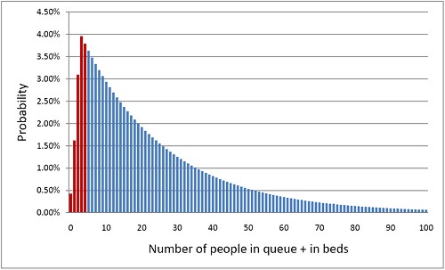
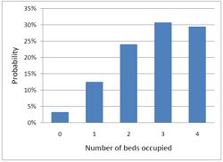
The histogram shows the total number of people in the system.The first five bins (red) represent the probabilities of 0, 1, 2, 3 or 4 beds being occupied. All the rest are in the queue.
What if you can’t queue?
For a High Dependency Unit or an Intensive Care Unit you can’t have a queue. If there is no bed, you are turned away. In the example just described, 91% of patients would have to wait, and that’s impossible in an HDU or ICU. The necessary statistical theory has been done for this case too (it is described as having zero queue capacity). Let’s look at the same case, with 4 beds, mean time between arrival of patients, 0.5 days, mean length of stay 1.917 days (46 hours).
|
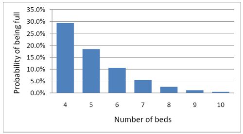
In this case there is no queue so the only possibilities are that 0, 1, 2, 3 or all 4 beds are occupied. The relative probabilities of these cases are shown on the right (they add up to 100% because there are no other possibilities). |
|
Despite the pressure on the unit, the randomness ensures that beds are by no means always occupied. All four are occupied for only 29% of the time and the average occupancy is 2.7 so the resources are used only 68% of the time (rather than 95% when a queue was allowed to form). Worse still, there is a 29% chance of the system being full, so you would be turned away.
So how many beds do you need? Clearly the more beds you have, the smaller the chance of anyone being turned away. But more beds means more cost and less efficiency. This is how it works out in our case.
To get the chance of being turned away below 5%, rather than 29%, you’d have to double the number of beds from 4 to 8. But in doing so the beds would not be in use 68% of the time as with 4 beds, but for only 47% of the time.
|
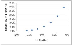
Looked at another way, if you try to increase the utilisation of beds, above 50 or 60%, then the rate at which patients get turned away goes shooting up exponentially. |
|
This isn’t inefficiency. It is an inevitable consequence of randomness in arrival times and lengths of stay.
A real life example
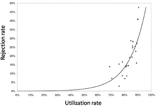
McManus et al. (2004) looked at all admissions to the medical–surgical Intensive Care Unit (ICU) of a large, urban children’s hospital in the USA during a 2-year period. (Anesthesiology 2004; 100:1271–6. Download pdf). Their Figure 2 shows the monthly average rejection rates mostly vary between 10 and 20%, so there is nothing unusual in there being no bed available in the private US medical system. For a period the rate of rejection reaches disastrous values, up to 47%. This happens, unsurprisingly, at times when the utilisation of beds was high.
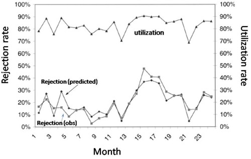
The observed relationship (McManus, Fig. 3) is very much as predicted above.with a very steep (roughly exponential) rise in rejection rate when the beds are in use for more than half the time.
How to do the calculations
You can get the message without reading this section. It’s included for those who want to know a bit more about what we mean when we say that patients arrive at random rather than at fixed intervals, and that durations of stay in the unit have random rather than fixed durations.
Consider the durations of stay in the unit. They are variable in length and the usual way to represent variability is to plot a distribution of the variable quantity. The best known sort of probability distribution is the bell-shaped curve known as the Gaussian distribution. This is shown at the top of the Figure (note that pdf stands for probability density function, not portable document format).
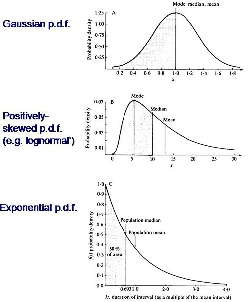
Not every sort of variability is described by a symmetrical bell-shaped curve. Quite often distributions with a positive skew are seen, like the middle example in the Figure. The distribution of incomes in the population have this sort of shape. Notice that more people earn less than average than earn more than average (the median is less than the mean). This can happen because those that earn less than average can’t get much less than average (unless we allow negative incomes), whereas bankers can earn (or at least be paid) a great deal more than average. The most frequent income (the peak of the distribution) is still smaller than the median.
An extreme form of a positively-skewed distribution is shown at the bottom. It is called the exponential distribution (because it has the shape of a decaying exponential curve). If this described personal incomes (and we are heading that way) it would mean that the most frequent income was zero and 63.2% of people earn less than average.
It is this last, rather unusual, sort of distribution that, in the simplest case, describes the lengths of random time intervals. This is getting very close to my day job. If an ion channel has a single open state, the lengths of individual ion channel openings is described by an exponential distribution.
|
The observation of an exponential distribution of durations is what would be predicted for a memoryless process, or Markov process. In the case of an ion channel, memoryless means that the probability of the channel shutting in the next microsecond is the same however long the channel has been open, This is exactly analogous to the fact that the probability of throwing a six with a die is exactly the same at each throw, regardless of how many sixes have been thrown before. |
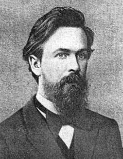
Andrei A. Markov, 1856-1922 |
It is the simplest definition of a random length of time. For those who have done a bit of statistics, it is worth mentioning that if the number of events per unit time is described by a Poisson distribution, then the interval between events are exponentially-distributed. They are different ways of saying the same thing.
|
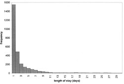
The lengths of stays in ICU in the McManus paper were roughly exponentially-distributed (right). The monthly average duration of stay ranged from 2.4 to 5.5 days, and average monthly admission rates to the 18 bed unit ranged from 4.6 to 6.2 patients per day. |
|
The monthly average percentage of patients who were turned away because there were no vacant beds varied widely, ranging from 3% up to a disastrous 47%
A technical note and an analogy with synapses
It’s intriguing to note that, in the simplest case, the time you’d spend waiting in a queue would have a simple exponential distribution (plus a discrete bit for the times when you don’t have to wait at all). The time you have to wait is the sum of all the lengths of stay of the people in front of you, and each of these lengths, in the case we discussing, is exponentially-distributed. If the queue was constant in length you can use a mathematical method known as convolution to show that the distribution of waiting time would follow a gamma distribution, a sort of distribution that goes through a peak, and eventually becomes Gaussian for long queues), However the queue is not fixed in length but its length is random (geometrically-distributed). It turns out that the distribution of the sum of a random number of exponentially distributed times is itself exponential. It is precisely this beautiful theorem that shows why the length of a burst of ion channel openings (which consists of the sum of a random number of exponentially-distributed open times, if you neglect the time spent in short shuttings) is, to a good approximation itself exponential, And that explains why the decay of synaptic currents is often close to following a simple exponential time course.
The calculations
The calculations for these graphs were done with a set of Excel add-in functions, Queueing Toolpak 4.0, which can be downloaded here. If this had been a paper of my own, rather than a blog post written in one weekend, I’d have done the algebra myself, just to be sure, The theory has much in common with that of single ion channels. Transitions between different states of the system can be described by transition rates or probabilities that don’t vary with time. The table, or matrix, of transition probabilities can be used to calculate the results, And if you want to know about the algebra of matrices, you could always apply for our summer workshop. There are some pictures from the workshop here.
Follow-up
Of course it is quite impossible for anyone who was around in the 60s to hear the name of a Russian mathematician without thinking of Tom Lehrer’s totally unjustified slur on another great Russian mathematician, Nicolai Ivanovich Lobachevsky. If you’ve never heard ‘Plagiarize’, you can hear it on Youtube. Sheer genius.
Why the size of the unit matters
This section was added as a result of a comment, below, from a statistician
At first glance one might think that if we quadruple the number of beds to 16 beds rather than 4, and we also quadruple the arrival rate to 8 rather than 2 per day, then the arrival rate per bed is the same and one might expect everything would stay the same.
As you say, it doesn’t.
If queueing was allowed, the mean queue length would be only slightly shorter, 18,7 rather than 20.9, but the mean time spent in the queue would fall from 10.5 days to 2.3 days.
In the more realistic case, with no queuing allowed, the rejection rate would fall from 29.4% to 15.5% and bed utilisation would increase from 68% to 81%. The rejection rate seems to fall roughly as the square root of the number of beds.
Clearly there is an advantage to having a big hospital with a big HDU.
Stochastic processes quite often behave unintuitive ways (unless you’ve spent years developing the right intuition).