
Download Lectures on Biostatistics (1971). Corrected and searchable version of Google books edition
Download review of Lectures on Biostatistics (THES, 1973).
statistics
This is a transcript of the talk that I gave to the RIOT science club on 1st October 2020. The video of the talk is on YouTube . The transcript was very kindly made by Chris F Carroll, but I have modified it a bit here to increase clarity. Links to the original talk appear throughout.
My title slide is a picture of UCL’s front quad, taken on the day that it was the starting point for the second huge march that attempted to stop the Iraq war. That’s a good example of the folly of believing things that aren’t true.

“Today I speak to you of war. A war that has pitted statistician against statistician for nearly 100 years. A mathematical conflict that has recently come to the attention of the normal people and these normal people look on in fear, in horror, but mostly in confusion because they have no idea why we’re fighting.”
Kristin Lennox (Director of Statistical Consulting, Lawrence Livermore National Laboratory)
That sums up a lot of what’s been going on. The problem is that there is near unanimity among statisticians that p values don’t tell you what you need to know but statisticians themselves haven’t been able to agree on a better way of doing things.
This talk is about the probability that if we claim to have made a discovery we’ll be wrong. This is what people very frequently want to know. And that is not the p value. You want to know the probability that you’ll make a fool of yourself by claiming that an effect is real when in fact it’s nothing but chance.
Just to be clear, what I’m talking about is how you interpret the results of a single unbiased experiment. Unbiased in the sense the experiment is randomized, and all the assumptions made in the analysis are exactly true. Of course in real life false positives can arise in any number of other ways: faults in the randomization and blinding, incorrect assumptions in the analysis, multiple comparisons, p hacking and so on, and all of these things are going to make the risk of false positives even worse. So in a sense what I’m talking about is your minimum risk of making a false positive even if everything else were perfect.
The conclusion of this talk will be:
If you observe a p value close to 0.05 and conclude that you’ve discovered something, then the chance that you’ll be wrong is not 5%, but is somewhere between 20% and 30% depending on the exact assumptions you make. If the hypothesis was an implausible one to start with, the false positive risk will be much higher.
There’s nothing new about this at all. This was written by a psychologist in 1966.
The major point of this paper is that the test of significance does not provide the information concerning phenomena characteristically attributed to it, and that a great deal of mischief has been associated with its use.
Bakan, D. (1966) Psychological Bulletin, 66 (6), 423 – 237
Bakan went on to say this is already well known, but if so it’s certainly not well known, even today, by many journal editors or indeed many users.
The p value
Let’s start by defining the p value. An awful lot of people can’t do this but even if you can recite it, it’s surprisingly difficult to interpret it.
I’ll consider it in the context of comparing two independent samples to make it a bit more concrete. So the p value is defined thus:
If there were actually no effect -for example if the true means of the two samples were equal, so the difference was zero -then the probability of observing a value for the difference between means which is equal to or greater than that actually observed is called the p value.
Now there’s at least five things that are dodgy with that, when you think about it. It sounds very plausible but it’s not.
- “If there are actually no effect …”: first of all this implies that the denominator for the probability is the number of cases in which there is no effect and this is not known.
- “… or greater than…” : why on earth should we be interested in values that haven’t been observed? We know what the effect size that was observed was, so why should we be interested in values that are greater than that which haven’t been observed?
- It doesn’t compare the hypothesis of no effect with anything else. This is put well by Sellke et al in 2001, “knowing that the data are rare when there is no true difference [that’s what the p value tells you] is of little use unless one determines whether or not they are also rare when there is a true difference”. In order to understand things properly, you’ve got to have not only the null hypothesis but also an alternative hypothesis.
- Since the definition assumes that the null hypothesis is true, it’s obvious that it can’t tell us about the probability that the null hypothesis is true.
- The definition invites users to make the error of the transposed conditional. That sounds a bit fancy but it’s very easy to say what it is.
- The probability that you have four legs given that you’re a cow is high but the probability that you’re a cow given that you’ve got four legs is quite low many animals that have four legs that aren’t cows.
- Take a legal example. The probability of getting the evidence given that you’re guilty may be known. (It often isn’t of course — but that’s the sort of thing you can hope to get). But it’s not what you want. What you want is the probability that you’re guilty given the evidence.
- The probability you’re catholic given that you’re the pope is probably very high, but the probability you’re a pope given that you’re a catholic is very low.
So now to the nub of the matter.
- The probability of the observations given that the null hypothesis is the p value. But it’s not what you want. What you want is the probability that the null hypothesis is true given the observations.
The first statement is a deductive process; the second process is inductive and that’s where the problems lie. These probabilities can be hugely different and transposing the conditional simply doesn’t work.
The False Positive Risk
The false positive risk avoids these problems. Define the false positive risk as follows.
If you declare a result to be “significant” based on a p value after doing a single unbiased experiment, the False Positive Risk is the probability that your result is in fact a false positive.
That, I maintain, is what you need to know. The problem is that in order to get it, you need Bayes’ theorem and as soon as that’s mentioned, contention immediately follows.
Bayes’ theorem
Suppose we call the null-hypothesis H0, and the alternative hypothesis H1. For example, H0 can be that the true effect size is zero and H1 can be the hypothesis that there’s a real effect, not just chance. Bayes’ theorem states that the odds on H1 being true, rather than H0 , after you’ve done the experiment are equal to the likelihood ratio times the odds on there being a real effect before the experiment:

In general we would want a Bayes’ factor here, rather than the likelihood ratio, but under my assumptions we can use the likelihood ratio, which is a much simpler thing [explanation here].
The likelihood ratio represents the evidence supplied by the experiment. It’s what converts the prior odds to the posterior odds, in the language of Bayes’ theorem. The likelihood ratio is a purely deductive quantity and therefore uncontentious. It’s the probability of the observations if there’s a real effect divided by the probability of the observations if there’s no effect.
Notice a simplification you can make: if the prior odds equal 1, then the posterior odds are simply equal to the likelihood ratio. “Prior odds of 1” means that it’s equally probable before the experiment that there was an effect or that there’s no effect. Put another way, prior odds of 1 means that the prior probability of H0 and of H1 are equal: both are 0.5. That’s probably the nearest you can get to declaring equipoise.
Comparison: Consider Screening Tests
I wrote a statistics textbook in 1971 [download it here] which by and large stood the test of time but the one thing I got completely wrong was the limitations of p values. Like many other people I came to see my errors through thinking about screening tests. These are very much in the news at the moment because of the COVID-19 pandemic. The illustration of the problems they pose which follows is now quite commonplace.
Suppose you test 10,000 people and that 1 in a 100 of those people have the condition, e.g. Covid-19, and 99 don’t have it. The prevalence in the population you’re testing is 1 in a 100. So you have 100 people with the condition and 9,900 who don’t. If the specificity of the test is 95%, you get 5% false positives.

This is very much like a null-hypothesis test of significance. But you can’t get the answer without considering the alternative hypothesis, which null-hypothesis significance tests don’t do. So now add the upper arm to the Figure above.

You’ve got 1% (so that’s 100 people) who have the condition, so if the sensitivity of the test is 80% (that’s like the power of a significance test) then you get to the total number of positive tests is 80 plus 495 and the proportion of tests that are false is 495 false positives divided by the total number of positives, which is 86%. A test that gives 86% false positives is pretty disastrous. It is not 5%! Most people are quite surprised by that when they first come across it.
Now look at significance tests in a similar way
Now we can do something similar for significance tests (though the parallel is not exact, as I’ll explain).
Suppose we do 1,000 tests and in 10% of them there’s a real effect, and in 90% of them there is no effect. If the significance level, so-called, is 0.05 then we get 5% false positive tests, which is 45 false positives.

But that’s as far as you can go with a null-hypothesis significance test. You can’t tell what’s going on unless you consider the other arm. If the power is 80% then we get 80 true positive tests and 20 false negative tests, so the total number of positive tests is 80 plus 45 and the false positive risk is the number of false positives divided by the total number of positives which is 36 percent.

So the p value is not the false positive risk. And the type 1 error rate is not the false positive risk.
The difference between them lies not in the numerator, it lies in the denominator. In the example above, of the 900 tests in which the null-hypothesis was true, there were 45 false positives. So looking at it from the classical point of view, the false positive risk would turn out to be 45 over 900 which is 0.05 but that’s not what you want. What you want is the total number of false positives, 45, divided by the total number of positives (45+80), which is 0.36.
The p value is NOT the probability that your results occurred by chance. The false positive risk is.
A complication: “p-equals” vs “p-less-than”
But now we have to come to a slightly subtle complication. It’s been around since the 1930s and it was made very explicit by Dennis Lindley in the 1950s. Yet it is unknown to most people which is very weird. The point is that there are two different ways in which we can calculate the likelihood ratio and therefore two different ways of getting the false positive risk.
A lot of writers including Ioannidis and Wacholder and many others use the “p less than” approach. That’s what that tree diagram gives you. But it is not what is appropriate for interpretation of a single experiment. It underestimates the false positive risk.
What we need is the “p equals” approach, and I’ll try and explain that now.
Suppose we do a test and we observe p = 0.047 then all we are interested in is, how tests behave that come out with p = 0.047. We aren’t interested in any other different p value. That p value is now part of the data. The tree diagram approach we’ve just been through gave a false positive risk of only 6%, if you assume that the prevalence of true effects was 0.5 (prior odds of 1). 6% isn’t much different from 5% so it might seem okay.
But the tree diagram approach, although it is very simple, still asks the wrong question. It looks at all tests that gives p ≤ 0.05, the “p-less-than” case. If we observe p = 0.047 then we should look only at tests that give p = 0.047 rather than looking at all tests which come out with p ≤ 0.05. If you’re doing it with simulations of course as in my 2014 paper then you can’t expect any tests to give exactly 0.047; what you can do is look at all the tests that come out with p in a narrow band around there, say 0.045 ≤ p ≤ 0.05.
This approach gives a different answer from the tree diagram approach. If you look at only tests that give p values between 0.045 and 0.05, the false positive risk turns out to be not 6% but at least 26%.
I say at least, because that assumes a prior probability of there being a real effect of 50:50. If only 10% of the experiments had a real effect of (a prior of 0.1 in the tree diagram) this rises to 76% of false positives. That really is pretty disastrous. Now of course the problem is you don’t know this prior probability.
The problem with Bayes theorem is that there exists an infinite number of answers. Not everyone agrees with my approach, but it is one of the simplest.
The likelihood-ratio approach to comparing two hypotheses
The likelihood ratio -that is to say, the relative probabilities of observing the data given two different hypotheses, is the natural way to compare two hypotheses. For example, in our case one hypothesis is the zero effect (that’s the null-hypothesis) and the other hypothesis is that there’s a real effect of the observed size. That’s the maximum likelihood estimate of the real effect size. Notice that we are not saying that the effect size is exactly zero; but rather we are asking whether a zero effect explains the observations better than a real effect.
Now this amounts to putting a “lump” of probability on there being a zero effect. If you put a prior probability of 0.5 for there being a zero effect, you’re saying the prior odds are 1. If you are willing to put a lump of probability on the null-hypothesis, then there are several methods of doing that. They all give similar results to mine within a factor of two or so.
Putting a lump of probability on their being a zero effect, for example a prior probability of 0.5 of there being zero effect, is regarded by some people as being over-sceptical (though others might regard 0.5 as high, given that most bright ideas are wrong).
E.J. Wagenmakers summed it up in a tweet:
“at least Bayesians attempt to find an approximate answer to the right question instead of struggling to interpret an exact answer to the wrong question [that’s the p value]”.
Some results.
The 2014 paper used simulations, and that’s a good way to see what’s happening in particular cases. But to plot curves of the sort shown in the next three slides we need exact calculations of FPR and how to do this was shown in the 2017 paper (see Appendix for details).
Comparison of p-equals and p-less-than approaches
The slide at slide at 26:05 is designed to show the difference between the “p-equals” and the “p-less than” cases.

On each diagram the dashed red line is the “line of equality”: that’s where the points would lie if the p value were the same as the false positive risk. You can see that in every case the blue lines -the false positive risk -is greater than the p value. And for any given observed p value, the p-equals approach gives a bigger false positive risk than the p-less-than approach. For a prior probability of 0.5 then the false positive risk is about 26% when you’ve observed p = 0.05.
So from now on I shall use only the “p-equals” calculation which is clearly what’s relevant to a test of significance.
The false positive risk as function of the observed p value for different sample sizes
Now another set of graphs (slide at 27:46), for the false positive risk as a function of the observed p value, but this time we’ll vary the number in each sample. These are all for comparing two independent samples.

The curves are red for n = 4 ; green for n = 8 ; blue for n = 16.
The top row is for an implausible hypothesis with a prior of 0.1, the bottom row for a plausible hypothesis with a prior of 0.5.
The left column shows arithmetic plots; the right column shows the same curves in log-log plots, The power these lines correspond to is:
- n = 4 (red) has power 22%
- n = 8 (green) has power 46%
- n = 16 (blue) one has power 78%
Now you can see these behave in a slightly curious way. For most of the range it’s what you’d expect: n = 4 gives you a higher false positive risk than n = 8 and that still higher than n = 16 the blue line.
The curves behave in an odd way around 0.05; they actually begin to cross, so the false positive risk for p values around 0.05 is not strongly dependent on sample size.
But the important point is that in every case they’re above the line of equality, so the false positive risk is much bigger than the p value in any circumstance.
False positive risk as a function of sample size (i.e. of power)
Now the really interesting one (slide at 29:34). When I first did the simulation study I was challenged by the fact that the false positive risk actually becomes 1 if the experiment is a very powerful one. That seemed a bit odd.

The plot here is the false positive risk FPR50 which I define as “the false positive risk for prior odds of 1, i.e. a 50:50 chance of being a real effect or not a real effect.
Let’s just concentrate on the p = 0.05 curve (blue). Notice that, because the number per sample is changing, the power changes throughout the curve. For example on the p = 0.05 curve for n = 4 (that’s the lowest sample size plotted), power is 0.22, but if we go to the other end of the curve, n = 64 (the biggest sample size plotted), the power is 0.9999. That’s something not achieved very often in practice.
But how is it that p = 0.05 can give you a false positive risk which approaches 100%? Even with p = 0.001 the false positive risk will eventually approach 100% though it does so later and more slowly.
In fact this has been known for donkey’s years. It’s called the Jeffreys-Lindley paradox, though there’s nothing paradoxical about it. In fact it’s exactly what you’d expect. If the power is 99.99% then you expect almost every p value to be very low. Everything is detected if we have a high power like that. So it would be very rare, with that very high power, to get a p value as big as 0.05. Almost every p value will be much less than 0.05, and that’s why observing a p value as big as 0.05 would, in that case, provide strong evidence for the null-hypothesis. Even p = 0.01 would provide strong evidence for the null hypothesis when the power is very high because almost every p value would be much less than 0.01.
This is a direct consequence of using the p-equals definition which I think is what’s relevant for testing hypotheses. So the Jeffreys-Lindley phenomenon makes absolute sense.
In contrast, if you use the p-less-than approach, the false positive risk would decrease continuously with the observed p value. That’s why, if you have a big enough sample (high enough power), even the smallest effect becomes “statistically significant”, despite the fact that the odds may favour strongly the null hypothesis. [Here, ‘the odds’ means the likelihood ratio calculated by the p-equals method.]
A real life example
Now let’s consider an actual practical example. The slide shows a study of transcranial electromagnetic stimulation published in Science magazine (so a bit suspect to begin with).

The study concluded (among other things) that an improved associated memory performance was produced by transcranial electromagnetic stimulation, p = 0.043. In order to find out how big the sample sizes were I had to dig right into the supplementary material. It was only 8. Nonetheless let’s assume that they had an adequate power and see what we make of it.
In fact it wasn’t done in a proper parallel group way, it was done as ‘before and after’ the stimulation, and sham stimulation, and it produces one lousy asterisk. In fact most of the paper was about functional magnetic resonance imaging, memory was mentioned only as a subsection of Figure 1, but this is what was tweeted out because it sounds more dramatic than other things and it got a vast number of retweets. Now according to my calculations p = 0.043 means there’s at least an 18% chance that it’s false positive.
How better might we express the result of this experiment?
We should say, conventionally, that the increase in memory performance was 1.88 ± 0.85 (SEM) with confidence interval 0.055 to 3.7 (extra words recalled on a baseline of about 10). Thus p = 0.043. But then supplement this conventional statement with
This implies a false positive risk, FPR50, (i.e. the probability that the results occurred by chance only) of at least 18%, so the result is no more than suggestive.
There are several other ways you can put the same idea. I don’t like them as much because they all suggest that it would be helpful to create a new magic threshold at FPR50 = 0.05, and that’s as undesirable as defining a magic threshold at p = 0.05. For example you could say that the increase in performance gave p = 0.043, and in order to reduce the false positive risk to 0.05 it would be necessary to assume that the prior probability of there being a real effect was 81%. In other words, you’d have to be almost certain that there was a real effect before you did the experiment before that result became convincing. Since there’s no independent evidence that that’s true, the result is no more than suggestive.
Or you could put it this way: the increase in performance gave p = 0.043. In order to reduce the false positive risk to 0.05 it would have been necessary to observe p = 0.0043, so the result is no more than suggestive.
The reason I now prefer the first of these possibilities is because the other two involve an implicit threshold of 0.05 for the false positive risk and that’s just as daft as assuming a threshold of 0.05 for the p value.
The web calculator
Scripts in R are provided with all my papers. For those who can’t master R Studio, you can do many of the calculations very easily with our web calculator [for latest links please go to http://www.onemol.org.uk/?page_id=456]. There are three options : if you want to calculate the false positive risk for a specified p value and prior, you enter the observed p value (e.g. 0.049), the prior probability that there’s a real effect (e.g. 0.5), the normalized effect size (e.g. 1 standard deviation) and the number in each sample. All the numbers cited here are based on an effect size if 1 standard deviation, but you can enter any value in the calculator. The output panel updates itself automatically.

We see that the false positive risk for the p-equals case is 0.26 and the likelihood ratio is 2.8 (I’ll come back to that in a minute).
Using the web calculator or using the R programs which are provided with the papers, this sort of table can be very quickly calculated.

The top row shows the results if we observe p = 0.05. The prior probability that you need to postulate to get a 5% false positive risk would be 87%. You’d have to be almost ninety percent sure there was a real effect before the experiment, in order to to get a 5% false positive risk. The likelihood ratio comes out to be about 3; what that means is that your observations will be about 3 times more likely if there was a real effect than if there was no effect. 3:1 is very low odds compared with the 19:1 odds which you might incorrectly infer from p = 0.05. The false positive risk for a prior of 0.5 (the default value) which I call the FPR50, would be 27% when you observe p = 0.05.
In fact these are just directly related to each other. Since the likelihood ratio is a purely deductive quantity, we can regard FPR50 as just being a transformation of the likelihood ratio and regard this as also a purely deductive quantity. For example, 1 / (1 + 2.8) = 0.263, the FPR50. But in order to interpret it as a posterior probability then you do have to go into Bayes’ theorem. If the prior probability of a real effect was only 0.1 then that would correspond to a 76% false positive risk when you’ve observed p = 0.05.
If we go to the other extreme, when we observe p = 0.001 (bottom row of the table) the likelihood ratio is 100 -notice not 1000, but 100 -and the false positive risk, FPR50 , would be 1%. That sounds okay but if it was an implausible hypothesis with only a 10% prior chance of being true (last column of Table), then the false positive risk would be 8% even when you observe p = 0.001: even in that case it would still be above 5%. In fact, to get the FPR down to 0.05 you’d have to observe p = 0.00043, and that’s good food for thought.
So what do you do to prevent making a fool of yourself?
- Never use the words significant or non-significant and then don’t use those pesky asterisks please, it makes no sense to have a magic cut off. Just give a p value.
- Don’t use bar graphs. Show the data as a series of dots.
- Always remember, it’s a fundamental assumption of all significance tests that the treatments are randomized. When this isn’t the case, you can still calculate a test but you can’t expect an accurate result. This is well-illustrated by thinking about randomisation tests.
- So I think you should still state the p value and an estimate of the effect size with confidence intervals but be aware that this tells you nothing very direct about the false positive risk. The p value should be accompanied by an indication of the likely false positive risk. It won’t be exact but it doesn’t really need to be; it does answer the right question. You can for example specify the FPR50, the false positive risk based on a prior probability of 0.5. That’s really just a more comprehensible way of specifying the likelihood ratio. You can use other methods, but they all involve an implicit threshold of 0.05 for the false positive risk. That isn’t desirable.
So p = 0.04 doesn’t mean you discovered something, it means it might be worth another look. In fact even p = 0.005 can under some circumstances be more compatible with the null-hypothesis than with there being a real effect.
We must conclude, however reluctantly, that Ronald Fisher didn’t get it right. Matthews (1998) said,
“the plain fact is that 70 years ago Ronald Fisher gave scientists a mathematical machine for turning boloney into breakthroughs and flukes into funding”.
Robert Matthews Sunday Telegraph, 13 September 1998.
But it’s not quite fair to blame R. A. Fisher because he himself described the 5% point as a “quite a low standard of significance”.

Questions & Answers
Q: “There are lots of competing ideas about how best to deal with the issue of statistical testing. For the non-statistician it is very hard to evaluate them and decide on what is the best approach. Is there any empirical evidence about what works best in practice? For example, training people to do analysis in different ways, and then getting them to analyze data with known characteristics. If not why not? It feels like we wouldn’t rely so heavily on theory in e.g. drug development, so why do we in stats?
A: The gist: why do we rely on theory and statistics? Well, we might as well say, why do we rely on theory in mathematics? That’s what it is! You have concrete theories and concrete postulates. Which you don’t have in drug testing, that’s just empirical.
Q: Is there any empirical evidence about what works best in practice, so for example training people to do analysis in different ways? and then getting them to analyze data with known characteristics and if not why not?
A: Why not: because you never actually know unless you’re doing simulations what the answer should be. So no, it’s not known which works best in practice. That being said, simulation is a great way to test out ideas. My 2014 paper used simulation, and it was only in the 2017 paper that the maths behind the 2014 results was worked out. I think you can rely on the fact that a lot of the alternative methods give similar answers. That’s why I felt justified in using rather simple assumptions for mine, because they’re easier to understand and the answers you get don’t differ greatly from much more complicated methods.
In my 2019 paper there’s a comparison of three different methods, all of which assume that it’s reasonable to test a point (or small interval) null-hypothesis (one that says that treatment effect is exactly zero), but given that assumption, all the alternative methods give similar answers within a factor of two or so. A factor of two is all you need: it doesn’t matter if it’s 26% or 52% or 13%, the conclusions in real life are much the same.
So I think you might as well use a simple method. There is an even simpler one than mine actually, proposed by Sellke et al. (2001) that gives a very simple calculation from the p value and that gives a false positive risk of 29 percent when you observe p = 0.05. My method gives 26%, so there’s no essential difference between them. It doesn’t matter which you use really.
Q: The last question gave an example of training people so maybe he was touching on how do we teach people how to analyze their data and interpret it accurately. Reporting effect sizes and confidence intervals alongside p values has been shown to improve interpretation in teaching contexts. I wonder whether in your own experience that you have found that this helps as well? Or can you suggest any ways to help educators, teachers, lecturers, to help the next generation of researchers properly?
A: Yes I think you should always report the observed effect size and confidence limits for it. But be aware that confidence intervals tell you exactly the same thing as p values and therefore they too are very suspect. There’s a simple one-to-one correspondence between p values and confidence limits. So if you use the criterion, “the confidence limits exclude zero difference” to judge whether there’s a real effect you’re making exactly the same mistake as if you use p ≤ 0.05 to to make the judgment. So they they should be given for sure, because they’re sort of familiar but you do need, separately, some sort of a rough estimate of the false positive risk too.
Q: I’m struggling a bit with the “p equals” intuition. How do you decide the band around 0.047 to use for the simulations? Presumably the results are very sensitive to this band. If you are using an exact p value in a calculation rather than a simulation, the probability of exactly that p value to many decimal places will presumably become infinitely small. Any clarification would be appreciated.
A: Yes, that’s not too difficult to deal with: you’ve got to use a band which is wide enough to get a decent number in. But the result is not at all sensitive to that: if you make it wider, you’ll get larger numbers in both numerator and denominator so the result will be much the same. In fact, that’s only a problem if you do it by simulation. If you do it by exact calculation it’s easier. To do a 100,000 or a million t-tests with my R script in simulation, doesn’t take long. But it doesn’t depend at all critically on the width of the interval; and in any case it’s not necessary to do simulations, you can do the exact calculation.
Q: Even if an exact calculation can’t be done—it probably can—you can get a better and better approximation by doing more simulations and using narrower and narrower bands around 0.047?
A: Yes, the larger the number of simulated tests that you do, the more accurate the answer. I did check it with a million occasionally. But once you’ve done the maths you can get exact answers much faster. The slide at 53:17 shows how you do the exact calculation.

• The Student’s t value along the bottom
• Probability density at the side
• The blue line is the distribution you get under the null-hypothesis, with a mean of 0 and a standard deviation of 1 in this case.
• So the red areas are the rejection areas for a t-test.
• The green curve is the t distribution (it’s a non-central t-distribution which is what you need in this case) for the alternative hypothesis.
• The yellow area is the power of the test, which here is 78%
• The orange area is (1 – power) so it’s 22%
The p-less-than calculation considers all values in the red area or in the yellow area as being positives. The p-equals calculation uses not the areas, but the ordinates here, the probability densities. The probability (density) of getting a t value of 2.04 under the null hypothesis is y0 = 0.053. And the probability (density) under the alternative hypothesis is y1 = 0.29. It’s true that the probability of getting t = 2.04 exactly is infinitesimally small (the area of an infinitesimally narrow band around t = 2.04) but the ratio if the two infinitesimally small probabilities is perfectly well-define). so for the p-equals approach, the likelihood ratio in favour of the alternative hypothesis would be L10 = y1 / 2y0 (the factor of 2 arises because of the two red tails) and that gives you a likelihood ratio of 2.8. That corresponds to an FPR50 of 26% as we explained. That’s exactly what you get from simulation. I hope that was reasonably clear. It may not have been if you aren’t familiar with looking at those sorts of things.
Q: To calculate FPR50 -false positive risk for a 50:50 prior -I need to assume an effect size. Which one do you use in the calculator? Would it make sense to calculate FPR50 for a range of effect sizes?
A: Yes if you use the web calculator or the R scripts then you need to specify what the normalized effect size is. You can use your observed one. If you’re trying to interpret real data, you’ve got an estimated effect size and you can use that. For example when you’ve observed p = 0.05 that corresponds to a likelihood ratio of 2.8 when you use the true effect size (that’s known when you do simulations). All you’ve got is the observed effect size. So they’re not the same of course. But you can easily show with simulations, that if you use the observed effect size in place of the the true effect size (which you don’t generally know) then that likelihood ratio goes up from about 2.8 to 3.6; it’s around 3, either way. You can plug your observed normalised effect size into the calculator and you won’t be led far astray. This shown in section 5 of the 2017 paper (especially section 5.1).
Q: Consider hypothesis H1 versus H2 which is the interpretation to go with?
A: Well I’m not quite clear still what the two interpretations the questioner is alluding to are but I shouldn’t rely on the p value. The most natural way to compare two hypotheses is the calculate the likelihood ratio.
You can do a full Bayesian analysis. Some forms of Bayesian analysis can give results that are quite similar to the p values. But that can’t possibly be generally true because are defined differently. Stephen Senn produced an example where there was essentially no problem with p value, but that was for a one-sided test with a fairly bizarre prior distribution.
In general in Bayes, you specify a prior distribution of effect sizes, what you believe before the experiment. Now, unless you have empirical data for what that distribution is, which is very rare indeed, then I just can’t see the justification for that. It’s bad enough making up the probability that there’s a real effect compared with there being no real effect. To make up a whole distribution just seems to be a bit like fantasy.
Mine is simpler because by considering a point null-hypothesis and a point alternative hypothesis, what in general would be called Bayes’ factors become likelihood ratios. Likelihood ratios are much easier to understand than Bayes’ factors because they just give you the relative probability of observing your data under two different hypotheses. This is a special case of Bayes’ theorem. But as I mentioned, any approach to Bayes’ theorem which assumes a point null hypothesis gives pretty similar answers, so it doesn’t really matter which you use.
There was edition of the American Statistician last year which had 44 different contributions about “the world beyond p = 0.05″. I found it a pretty disappointing edition because there was no agreement among people and a lot of people didn’t get around to making any recommendation. They said what was wrong, but didn’t say what you should do in response. The one paper that I did like was the one by Benjamin & Berger. They recommended their false positive risk estimate (as I would call it; they called it something different but that’s what it amounts to) and that’s even simpler to calculate than mine. It’s a little more pessimistic, it can give a bigger false positive risk for a given p value, but apart from that detail, their recommendations are much the same as mine. It doesn’t really matter which you choose.
Q: If people want a procedure that does not too often lead them to draw wrong conclusions, is it fine if they use a p value?
A: No, that maximises your wrong conclusions, among the available methods! The whole point is, that the false positive risk is a lot bigger than the p value under almost all circumstances. Some people refer to this as the p value exaggerating the evidence; but it only does so if you incorrectly interpret the p value as being the probability that you’re wrong. It certainly is not that.
Q: Your thoughts on, there’s lots of recommendations about practical alternatives to p values. Most notably the Nature piece that was published last year—something like 400 signatories—that said that we should retire the p value. Their alternative was to just report effect sizes and confidence intervals. Now you’ve said you’re not against anything that should be standard practice, but I wonder whether this alternative is actually useful, to retire the p value?
A: I don’t think the 400 author piece in Nature recommended ditching p values at all. It recommended ditching the 0.05 threshold, and just stating a p value. That would mean abandoning the term “statistically significant” which is so shockingly misleading for the reasons I’ve been talking about. But it didn’t say that you shouldn’t give p values, and I don’t think it really recommended an alternative. I would be against not giving p values because it’s the p value which enables you to calculate the equivalent false positive risk which would be much harder work if people didn’t give the p value.
If you use the false positive risk, you’ll inevitably get a larger false negative rate. So, if you’re using it to make a decision, other things come into it than the false positive risk and the p value. Namely, the cost of missing an effect which is real (a false negative), and the cost of getting a false positive. They both matter. If you can estimate the costs associated with either of them, then then you can draw some sort of optimal conclusion.
Certainly the costs of getting false positives or rather low for most people. In fact, there may be a great advantage to your career to publish a lot of false positives, unfortunately. This is the problem that the RIOT science club is dealing with I guess.
Q: What about changing the alpha level? To tinker with the alpha level has been popular in the light of the replication crisis, to make it even a more difficult test pass when testing your hypothesis. Some people have said that it should be 0.005 should be the threshold.
A: Daniel Benjamin said that and a lot of other authors. I wrote to them about that and they said that they didn’t really think it was very satisfactory but it would be better than the present practice. They regarded it as a sort of interim thing.
It’s true that you would have fewer false positives if you did that, but it’s a very crude way of treating the false positive risk problem. I would much prefer to make a direct estimate, even though it’s rough, of the false positive risk rather than just crudely reducing to p = 0.005. I do have a long paragraph in one of the papers discussing this particular thing {towards the end of Conclusions in the 2017 paper).
If you were willing to assume a 50:50 prior chance of there being a real effect the p = 0.005 would correspond to FPR50 = 0.034, which sounds satisfactory (from Table, above, or web calculator).
But if, for example, you are testing a hypothesis about teleportation or mind-reading or homeopathy then you probably wouldn’t be willing to give a prior of 50% to that being right before the experiment. If the prior probability of there being a real effect were 0.1, rather than 0.5, the Table above shows that observation of p = 0.005 would suggest, in my example, FPR = 0.24 and a 24% risk of a false positive would still be disastrous. In this case you would have to have observed p = 0.00043 in order to reduce the false positive risk to 0.05.
So no fixed p value threshold will cope adequately with every problem.
Links
- For up-to-date links to the web calculator, and to papers, start at http://www.onemol.org.uk/?page_id=456
- Colquhoun, 2014, An investigation of the false discovery rate and the
misinterpretation of p-values
https://royalsocietypublishing.org/doi/full/10.1098/rsos.140216 - Colquhoun, 2017, The reproducibility of research and the misinterpretation
of p-values https://royalsocietypublishing.org/doi/10.1098/rsos.171085 - Colquhoun, 2019, The False Positive Risk: A Proposal Concerning What to Do About p-Values
https://www.tandfonline.com/doi/full/10.1080/00031305.2018.1529622 - Benjamin & Berger, Three Recommendations for Improving the Use of p-Values
https://www.tandfonline.com/doi/full/10.1080/00031305.2018.1543135 - Sellke, T., Bayarri, M. J., and Berger, J. O. (2001), “Calibration of p Values for Testing Precise Null Hypotheses,” The American Statistician, 55, 62–71. DOI: 10.1198/000313001300339950. [Taylor & Francis Online],
This piece is almost identical with today’s Spectator Health article.
This week there has been enormously wide coverage in the press for one of the worst papers on acupuncture that I’ve come across. As so often, the paper showed the opposite of what its title and press release, claimed. For another stunning example of this sleight of hand, try Acupuncturists show that acupuncture doesn’t work, but conclude the opposite: journal fails, published in the British Journal of General Practice).
Presumably the wide coverage was a result of the hyped-up press release issued by the journal, BMJ Acupuncture in Medicine. That is not the British Medical Journal of course, but it is, bafflingly, published by the BMJ Press group, and if you subscribe to press releases from the real BMJ. you also get them from Acupuncture in Medicine. The BMJ group should not be mixing up press releases about real medicine with press releases about quackery. There seems to be something about quackery that’s clickbait for the mainstream media.
As so often, the press release was shockingly misleading: It said
Acupuncture may alleviate babies’ excessive crying Needling twice weekly for 2 weeks reduced crying time significantly
This is totally untrue. Here’s why.
|
Luckily the Science Media Centre was on the case quickly: read their assessment. The paper made the most elementary of all statistical mistakes. It failed to make allowance for the jelly bean problem. The paper lists 24 different tests of statistical significance and focusses attention on three that happen to give a P value (just) less than 0.05, and so were declared to be "statistically significant". If you do enough tests, some are bound to come out “statistically significant” by chance. They are false postives, and the conclusions are as meaningless as “green jelly beans cause acne” in the cartoon. This is called P-hacking and it’s a well known cause of problems. It was evidently beyond the wit of the referees to notice this naive mistake. It’s very doubtful whether there is anything happening but random variability. And that’s before you even get to the problem of the weakness of the evidence provided by P values close to 0.05. There’s at least a 30% chance of such values being false positives, even if it were not for the jelly bean problem, and a lot more than 30% if the hypothesis being tested is implausible. I leave it to the reader to assess the plausibility of the hypothesis that a good way to stop a baby crying is to stick needles into the poor baby. If you want to know more about P values try Youtube or here, or here. |
|

One of the people asked for an opinion on the paper was George Lewith, the well-known apologist for all things quackish. He described the work as being a "good sized fastidious well conducted study ….. The outcome is clear". Thus showing an ignorance of statistics that would shame an undergraduate.
On the Today Programme, I was interviewed by the formidable John Humphrys, along with the mandatory member of the flat-earth society whom the BBC seems to feel obliged to invite along for "balance". In this case it was professional acupuncturist, Mike Cummings, who is an associate editor of the journal in which the paper appeared. Perhaps he’d read the Science media centre’s assessment before he came on, because he said, quite rightly, that
"in technical terms the study is negative" "the primary outcome did not turn out to be statistically significant"
to which Humphrys retorted, reasonably enough, “So it doesn’t work”. Cummings’ response to this was a lot of bluster about how unfair it was for NICE to expect a treatment to perform better than placebo. It was fascinating to hear Cummings admit that the press release by his own journal was simply wrong.
Listen to the interview here
Another obvious flaw of the study is that the nature of the control group. It is not stated very clearly but it seems that the baby was left alone with the acupuncturist for 10 minutes. A far better control would have been to have the baby cuddled by its mother, or by a nurse. That’s what was used by Olafsdottir et al (2001) in a study that showed cuddling worked just as well as another form of quackery, chiropractic, to stop babies crying.
Manufactured doubt is a potent weapon of the alternative medicine industry. It’s the same tactic as was used by the tobacco industry. You scrape together a few lousy papers like this one and use them to pretend that there’s a controversy. For years the tobacco industry used this tactic to try to persuade people that cigarettes didn’t give you cancer, and that nicotine wasn’t addictive. The main stream media obligingly invite the representatives of the industry who convey to the reader/listener that there is a controversy, when there isn’t.
Acupuncture is no longer controversial. It just doesn’t work -see Acupuncture is a theatrical placebo: the end of a myth. Try to imagine a pill that had been subjected to well over 3000 trials without anyone producing convincing evidence for a clinically useful effect. It would have been abandoned years ago. But by manufacturing doubt, the acupuncture industry has managed to keep its product in the news. Every paper on the subject ends with the words "more research is needed". No it isn’t.
Acupuncture is pre-scientific idea that was moribund everywhere, even in China, until it was revived by Mao Zedong as part of the appalling Great Proletarian Revolution. Now it is big business in China, and 100 percent of the clinical trials that come from China are positive.
if you believe them, you’ll truly believe anything.
Follow-up
29 January 2017
Soon after the Today programme in which we both appeared, the acupuncturist, Mike Cummings, posted his reaction to the programme. I thought it worth posting the original version in full. Its petulance and abusiveness are quite remarkable.
I thank Cummings for giving publicity to the video of our appearance, and for referring to my Wikipedia page. I leave it to the reader to judge my competence, and his, in the statistics of clinical trials. And it’s odd to be described as a "professional blogger" when the 400+ posts on dcscience.net don’t make a penny -in fact they cost me money. In contrast, he is the salaried medical director of the British Medical Acupuncture Society.
It’s very clear that he has no understanding of the error of the transposed conditional, nor even the mulltiple comparison problem (and neither, it seems, does he know the meaning of the word ‘protagonist’).
I ignored his piece, but several friends complained to the BMJ for allowing such abusive material on their blog site. As a result a few changes were made. The “baying mob” is still there, but the Wikipedia link has gone. I thought that readers might be interested to read the original unexpurgated version. It shows, better than I ever could, the weakness of the arguments of the alternative medicine community. To quote Upton Sinclair:
“It is difficult to get a man to understand something, when his salary depends upon his not understanding it.”
It also shows that the BBC still hasn’t learned the lessons in Steve Jones’ excellent “Review of impartiality and accuracy of the BBC’s coverage of science“. Every time I appear in such a programme, they feel obliged to invite a member of the flat earth society to propagate their make-believe.
Acupuncture for infantile colic – misdirection in the media or over-reaction from a sceptic blogger?26 Jan, 17 | by Dr Mike Cummings So there has been a big response to this paper press released by BMJ on behalf of the journal Acupuncture in Medicine. The response has been influenced by the usual characters – retired professors who are professional bloggers and vocal critics of anything in the realm of complementary medicine. They thrive on oiling up and flexing their EBM muscles for a baying mob of fellow sceptics (see my ‘stereotypical mental image’ here). Their target in this instant is a relatively small trial on acupuncture for infantile colic.[1] Deserving of being press released by virtue of being the largest to date in the field, but by no means because it gave a definitive answer to the question of the efficacy of acupuncture in the condition. We need to wait for an SR where the data from the 4 trials to date can be combined. So what about the research itself? I have already said that the trial was not definitive, but it was not a bad trial. It suffered from under-recruiting, which meant that it was underpowered in terms of the statistical analysis. But it was prospectively registered, had ethical approval and the protocol was published. Primary and secondary outcomes were clearly defined, and the only change from the published protocol was to combine the two acupuncture groups in an attempt to improve the statistical power because of under recruitment. The fact that this decision was made after the trial had begun means that the results would have to be considered speculative. For this reason the editors of Acupuncture in Medicine insisted on alteration of the language in which the conclusions were framed to reflect this level of uncertainty. DC has focussed on multiple statistical testing and p values. These are important considerations, and we could have insisted on more clarity in the paper. P values are a guide and the 0.05 level commonly adopted must be interpreted appropriately in the circumstances. In this paper there are no definitive conclusions, so the p values recorded are there to guide future hypothesis generation and trial design. There were over 50 p values reported in this paper, so by chance alone you must expect some to be below 0.05. If one is to claim statistical significance of an outcome at the 0.05 level, ie a 1:20 likelihood of the event happening by chance alone, you can only perform the test once. If you perform the test twice you must reduce the p value to 0.025 if you want to claim statistical significance of one or other of the tests. So now we must come to the predefined outcomes. They were clearly stated, and the results of these are the only ones relevant to the conclusions of the paper. The primary outcome was the relative reduction in total crying time (TC) at 2 weeks. There were two significance tests at this point for relative TC. For a statistically significant result, the p values would need to be less than or equal to 0.025 – neither was this low, hence my comment on the Radio 4 Today programme that this was technically a negative trial (more correctly ‘not a positive trial’ – it failed to disprove the null hypothesis ie that the samples were drawn from the same population and the acupuncture intervention did not change the population treated). Finally to the secondary outcome – this was the number of infants in each group who continued to fulfil the criteria for colic at the end of each intervention week. There were four tests of significance so we need to divide 0.05 by 4 to maintain the 1:20 chance of a random event ie only draw conclusions regarding statistical significance if any of the tests resulted in a p value at or below 0.0125. Two of the 4 tests were below this figure, so we say that the result is unlikely to have been chance alone in this case. With hindsight it might have been good to include this explanation in the paper itself, but as editors we must constantly balance how much we push authors to adjust their papers, and in this case the editor focussed on reducing the conclusions to being speculative rather than definitive. A significant result in a secondary outcome leads to a speculative conclusion that acupuncture ‘may’ be an effective treatment option… but further research will be needed etc… Now a final word on the 3000 plus acupuncture trials that DC loves to mention. His point is that there is no consistent evidence for acupuncture after over 3000 RCTs, so it clearly doesn’t work. He first quoted this figure in an editorial after discussing the largest, most statistically reliable meta-analysis to date – the Vickers et al IPDM.[2] DC admits that there is a small effect of acupuncture over sham, but follows the standard EBM mantra that it is too small to be clinically meaningful without ever considering the possibility that sham (gentle acupuncture plus context of acupuncture) can have clinically relevant effects when compared with conventional treatments. Perhaps now the best example of this is a network meta-analysis (NMA) using individual patient data (IPD), which clearly demonstrates benefits of sham acupuncture over usual care (a variety of best standard or usual care) in terms of health-related quality of life (HRQoL).[3] |
30 January 2017
I got an email from the BMJ asking me to take part in a BMJ Head-to-Head debate about acupuncture. I did one of these before, in 2007, but it generated more heat than light (the only good thing to come out of it was the joke about leprechauns). So here is my polite refusal.
|
Hello Thanks for the invitation, Perhaps you should read the piece that I wrote after the Today programme Why don’t you do these Head to Heads about genuine controversies? To do them about homeopathy or acupuncture is to fall for the “manufactured doubt” stratagem that was used so effectively by the tobacco industry to promote smoking. It’s the favourite tool of snake oil salesman too, and th BMJ should see that and not fall for their tricks. Such pieces night be good clickbait, but they are bad medicine and bad ethics. All the best David |
This post arose from a recent meeting at the Royal Society. It was organised by Julie Maxton to discuss the application of statistical methods to legal problems. I found myself sitting next to an Appeal Court Judge who wanted more explanation of the ideas. Here it is.
Some preliminaries
The papers that I wrote recently were about the problems associated with the interpretation of screening tests and tests of significance. They don’t allude to legal problems explicitly, though the problems are the same in principle. They are all open access. The first appeared in 2014:
http://rsos.royalsocietypublishing.org/content/1/3/140216
Since the first version of this post, March 2016, I’ve written two more papers and some popular pieces on the same topic. There’s a list of them at http://www.onemol.org.uk/?page_id=456.
I also made a video for YouTube of a recent talk.
In these papers I was interested in the false positive risk (also known as the false discovery rate) in tests of significance. It turned out to be alarmingly large. That has serious consequences for the credibility of the scientific literature. In legal terms, the false positive risk means the proportion of cases in which, on the basis of the evidence, a suspect is found guilty when in fact they are innocent. That has even more serious consequences.
Although most of what I want to say can be said without much algebra, it would perhaps be worth getting two things clear before we start.
The rules of probability.
(1) To get any understanding, it’s essential to understand the rules of probabilities, and, in particular, the idea of conditional probabilities. One source would be my old book, Lectures on Biostatistics (now free), The account on pages 19 to 24 give a pretty simple (I hope) description of what’s needed. Briefly, a vertical line is read as “given”, so Prob(evidence | not guilty) means the probability that the evidence would be observed given that the suspect was not guilty.
(2) Another potential confusion in this area is the relationship between odds and probability. The relationship between the probability of an event occurring, and the odds on the event can be illustrated by an example. If the probability of being right-handed is 0.9, then the probability of being not being right-handed is 0.1. That means that 9 people out of 10 are right-handed, and one person in 10 is not. In other words for every person who is not right-handed there are 9 who are right-handed. Thus the odds that a randomly-selected person is right-handed are 9 to 1. In symbols this can be written
\[ \mathrm{probability=\frac{odds}{1 + odds}} \]
In the example, the odds on being right-handed are 9 to 1, so the probability of being right-handed is 9 / (1+9) = 0.9.
Conversely,
\[ \mathrm{odds =\frac{probability}{1 – probability}} \]
In the example, the probability of being right-handed is 0.9, so the odds of being right-handed are 0.9 / (1 – 0.9) = 0.9 / 0.1 = 9 (to 1).
With these preliminaries out of the way, we can proceed to the problem.
The legal problem
The first problem lies in the fact that the answer depends on Bayes’ theorem. Although that was published in 1763, statisticians are still arguing about how it should be used to this day. In fact whenever it’s mentioned, statisticians tend to revert to internecine warfare, and forget about the user.
Bayes’ theorem can be stated in words as follows
\[ \mathrm{\text{posterior odds ratio} = \text{prior odds ratio} \times \text{likelihood ratio}} \]
“Posterior odds ratio” means the odds that the person is guilty, relative to the odds that they are innocent, in the light of the evidence, and that’s clearly what one wants to know. The “prior odds” are the odds that the person was guilty before any evidence was produced, and that is the really contentious bit.
Sometimes the need to specify the prior odds has been circumvented by using the likelihood ratio alone, but, as shown below, that isn’t a good solution.
The analogy with the use of screening tests to detect disease is illuminating.
Screening tests
A particularly straightforward application of Bayes’ theorem is in screening people to see whether or not they have a disease. It turns out, in many cases, that screening gives a lot more wrong results (false positives) than right ones. That’s especially true when the condition is rare (the prior odds that an individual suffers from the condition is small). The process of screening for disease has a lot in common with the screening of suspects for guilt. It matters because false positives in court are disastrous.
The screening problem is dealt with in sections 1 and 2 of my paper. or on this blog (and here). A bit of animation helps the slides, so you may prefer the Youtube version.
The rest of my paper applies similar ideas to tests of significance. In that case the prior probability is the probability that there is in fact a real effect, or, in the legal case, the probability that the suspect is guilty before any evidence has been presented. This is the slippery bit of the problem both conceptually, and because it’s hard to put a number on it.
But the examples below show that to ignore it, and to use the likelihood ratio alone, could result in many miscarriages of justice.
In the discussion of tests of significance, I took the view that it is not legitimate (in the absence of good data to the contrary) to assume any prior probability greater than 0.5. To do so would presume you know the answer before any evidence was presented. In the legal case a prior probability of 0.5 would mean assuming that there was a 50:50 chance that the suspect was guilty before any evidence was presented. A 50:50 probability of guilt before the evidence is known corresponds to a prior odds ratio of 1 (to 1) If that were true, the likelihood ratio would be a good way to represent the evidence, because the posterior odds ratio would be equal to the likelihood ratio.
It could be argued that 50:50 represents some sort of equipoise, but in the example below it is clearly too high, and if it is less that 50:50, use of the likelihood ratio runs a real risk of convicting an innocent person.
The following example is modified slightly from section 3 of a book chapter by Mortera and Dawid (2008). Philip Dawid is an eminent statistician who has written a lot about probability and the law, and he’s a member of the legal group of the Royal Statistical Society.
My version of the example removes most of the algebra, and uses different numbers.
Example: The island problem
The “island problem” (Eggleston 1983, Appendix 3) is an imaginary example that provides a good illustration of the uses and misuses of statistical logic in forensic identification.
A murder has been committed on an island, cut off from the outside world, on which 1001 (= N + 1) inhabitants remain. The forensic evidence at the scene consists of a measurement, x, on a “crime trace” characteristic, which can be assumed to come from the criminal. It might, for example, be a bit of the DNA sequence from the crime scene.
Say, for the sake of example, that the probability of a random member of the population having characteristic x is P = 0.004 (i.e. 0.4% ), so the probability that a random member of the population does not have the characteristic is 1 – P = 0.996. The mainland police arrive and arrest a random islander, Jack. It is found that Jack matches the crime trace. There is no other relevant evidence.
How should this match evidence be used to assess the claim that Jack is the murderer? We shall consider three arguments that have been used to address this question. The first is wrong. The second and third are right. (For illustration, we have taken N = 1000, P = 0.004.)
(1) Prosecutor’s fallacy
Prosecuting counsel, arguing according to his favourite fallacy, asserts that the probability that Jack is guilty is 1 – P , or 0.996, and that this proves guilt “beyond a reasonable doubt”.
The probability that Jack would show characteristic x if he were not guilty would be 0.4% i.e. Prob(Jack has x | not guilty) = 0.004. Therefore the probability of the evidence, given that Jack is guilty, Prob(Jack has x | Jack is guilty), is one 1 – 0.004 = 0.996.
But this is Prob(evidence | guilty) which is not what we want. What we need is the probability that Jack is guilty, given the evidence, P(Jack is guilty | Jack has characteristic x).
To mistake the latter for the former is the prosecutor’s fallacy, or the error of the transposed conditional.
Dawid gives an example that makes the distinction clear.
“As an analogy to help clarify and escape this common and seductive confusion, consider the difference between “the probability of having spots, if you have measles” -which is close to 1 and “the probability of having measles, if you have spots” -which, in the light of the many alternative possible explanations for spots, is much smaller.”
(2) Defence counter-argument
Counsel for the defence points out that, while the guilty party must have characteristic x, he isn’t the only person on the island to have this characteristic. Among the remaining N = 1000 innocent islanders, 0.4% have characteristic x, so the number who have it will be NP = 1000 x 0.004 = 4 . Hence the total number of islanders that have this characteristic must be 1 + NP = 5 . The match evidence means that Jack must be one of these 5 people, but does not otherwise distinguish him from any of the other members of it. Since just one of these is guilty, the probability that this is Jack is thus 1/5, or 0.2— very far from being “beyond all reasonable doubt”.
(3) Bayesian argument
The probability of the having characteristic x (the evidence) would be Prob(evidence | guilty) = 1 if Jack were guilty, but if Jack were not guilty it would be 0.4%, i.e. Prob(evidence | not guilty) = P. Hence the likelihood ratio in favour of guilt, on the basis of the evidence, is
\[ LR=\frac{\text{Prob(evidence } | \text{ guilty})}{\text{Prob(evidence }|\text{ not guilty})} = \frac{1}{P}=250 \]
In words, the evidence would be 250 times more probable if Jack were guilty than if he were innocent. While this seems strong evidence in favour of guilt, it still does not tell us what we want to know, namely the probability that Jack is guilty in the light of the evidence: Prob(guilty | evidence), or, equivalently, the odds ratio -the odds of guilt relative to odds of innocence, given the evidence,
To get that we must multiply the likelihood ratio by the prior odds on guilt, i.e. the odds on guilt before any evidence is presented. It’s often hard to get a numerical value for this. But in our artificial example, it is possible. We can argue that, in the absence of any other evidence, Jack is no more nor less likely to be the culprit than any other islander, so that the prior probability of guilt is 1/(N + 1), corresponding to prior odds on guilt of 1/N.
We can now apply Bayes’s theorem to obtain the posterior odds on guilt:
\[ \text {posterior odds} = \text{prior odds} \times LR = \left ( \frac{1}{N}\right ) \times \left ( \frac{1}{P} \right )= 0.25 \]
Thus the odds of guilt in the light of the evidence are 4 to 1 against. The corresponding posterior probability of guilt is
\[ Prob( \text{guilty } | \text{ evidence})= \frac{1}{1+NP}= \frac{1}{1+4}=0.2 \]
This is quite small –certainly no basis for a conviction.
This result is exactly the same as that given by the Defence Counter-argument’, (see above). That argument was simpler than the Bayesian argument. It didn’t explicitly use Bayes’ theorem, though it was implicit in the argument. The advantage of using the former is that it looks simpler. The advantage of the explicitly Bayesian argument is that it makes the assumptions more clear.
In summary The prosecutor’s fallacy suggested, quite wrongly, that the probability that Jack was guilty was 0.996. The likelihood ratio was 250, which also seems to suggest guilt, but it doesn’t give us the probability that we need. In stark contrast, the defence counsel’s argument, and equivalently, the Bayesian argument, suggested that the probability of Jack’s guilt as 0.2. or odds of 4 to 1 against guilt. The potential for wrong conviction is obvious.
Conclusions.
Although this argument uses an artificial example that is simpler than most real cases, it illustrates some important principles.
(1) The likelihood ratio is not a good way to evaluate evidence, unless there is good reason to believe that there is a 50:50 chance that the suspect is guilty before any evidence is presented.
(2) In order to calculate what we need, Prob(guilty | evidence), you need to give numerical values of how common the possession of characteristic x (the evidence) is the whole population of possible suspects (a reasonable value might be estimated in the case of DNA evidence), We also need to know the size of the population. In the case of the island example, this was 1000, but in general, that would be hard to answer and any answer might well be contested by an advocate who understood the problem.
These arguments lead to four conclusions.
(1) If a lawyer uses the prosecutor’s fallacy, (s)he should be told that it’s nonsense.
(2) If a lawyer advocates conviction on the basis of likelihood ratio alone, s(he) should be asked to justify the implicit assumption that there was a 50:50 chance that the suspect was guilty before any evidence was presented.
(3) If a lawyer uses Defence counter-argument, or, equivalently, the version of Bayesian argument given here, (s)he should be asked to justify the estimates of the numerical value given to the prevalence of x in the population (P) and the numerical value of the size of this population (N). A range of values of P and N could be used, to provide a range of possible values of the final result, the probability that the suspect is guilty in the light of the evidence.
(4) The example that was used is the simplest possible case. For more complex cases it would be advisable to ask a professional statistician. Some reliable people can be found at the Royal Statistical Society’s section on Statistics and the Law.
If you do ask a professional statistician, and they present you with a lot of mathematics, you should still ask these questions about precisely what assumptions were made, and ask for an estimate of the range of uncertainty in the value of Prob(guilty | evidence) which they produce.
Postscript: real cases
Another paper by Philip Dawid, Statistics and the Law, is interesting because it discusses some recent real cases: for example the wrongful conviction of Sally Clark because of the wrong calculation of the statistics for Sudden Infant Death Syndrome.
On Monday 21 March, 2016, Dr Waney Squier was struck off the medical register by the General Medical Council because they claimed that she misrepresented the evidence in cases of Shaken Baby Syndrome (SBS).
This verdict was questioned by many lawyers, including Michael Mansfield QC and Clive Stafford Smith, in a letter. “General Medical Council behaving like a modern inquisition”
The latter has already written “This shaken baby syndrome case is a dark day for science – and for justice“..
The evidence for SBS is based on the existence of a triad of signs (retinal bleeding, subdural bleeding and encephalopathy). It seems likely that these signs will be present if a baby has been shake, i.e Prob(triad | shaken) is high. But this is irrelevant to the question of guilt. For that we need Prob(shaken | triad). As far as I know, the data to calculate what matters are just not available.
It seem that the GMC may have fallen for the prosecutor’s fallacy. Or perhaps the establishment won’t tolerate arguments. One is reminded, once again, of the definition of clinical experience: “Making the same mistakes with increasing confidence over an impressive number of years.” (from A Sceptic’s Medical Dictionary by Michael O’Donnell. A Sceptic’s Medical Dictionary BMJ publishing, 1997).
Appendix (for nerds). Two forms of Bayes’ theorem
The form of Bayes’ theorem given at the start is expressed in terms of odds ratios. The same rule can be written in terms of probabilities. (This was the form used in the appendix of my paper.) For those interested in the details, it may help to define explicitly these two forms.
In terms of probabilities, the probability of guilt in the light of the evidence (what we want) is
\[ \text{Prob(guilty } | \text{ evidence}) = \text{Prob(evidence } | \text{ guilty}) \frac{\text{Prob(guilty })}{\text{Prob(evidence })} \]
In terms of odds ratios, the odds ratio on guilt, given the evidence (which is what we want) is
\[ \frac{ \text{Prob(guilty } | \text{ evidence})} {\text{Prob(not guilty } | \text{ evidence}} =
\left ( \frac{ \text{Prob(guilty)}} {\text {Prob((not guilty)}} \right )
\left ( \frac{ \text{Prob(evidence } | \text{ guilty})} {\text{Prob(evidence } | \text{ not guilty}} \right ) \]
or, in words,
\[ \text{posterior odds of guilt } =\text{prior odds of guilt} \times \text{likelihood ratio} \]
This is the precise form of the equation that was given in words at the beginning.
A derivation of the equivalence of these two forms is sketched in a document which you can download.
Follow-up
23 March 2016
It’s worth pointing out the following connection between the legal argument (above) and tests of significance.
(1) The likelihood ratio works only when there is a 50:50 chance that the suspect is guilty before any evidence is presented (so the prior probability of guilt is 0.5, or, equivalently, the prior odds ratio is 1).
(2) The false positive rate in signiifcance testing is close to the P value only when the prior probability of a real effect is 0.5, as shown in section 6 of the P value paper.
However there is another twist in the significance testing argument. The statement above is right if we take as a positive result any P < 0.05. If we want to interpret a value of P = 0.047 in a single test, then, as explained in section 10 of the P value paper, we should restrict attention to only those tests that give P close to 0.047. When that is done the false positive rate is 26% even when the prior is 0.5 (and much bigger than 30% if the prior is smaller –see extra Figure), That justifies the assertion that if you claim to have discovered something because you have observed P = 0.047 in a single test then there is a chance of at least 30% that you’ll be wrong. Is there, I wonder, any legal equivalent of this argument?
|
“Statistical regression to the mean predicts that patients selected for abnormalcy will, on the average, tend to improve. We argue that most improvements attributed to the placebo effect are actually instances of statistical regression.”
“Thus, we urge caution in interpreting patient improvements as causal effects of our actions and should avoid the conceit of assuming that our personal presence has strong healing powers.” |
In 1955, Henry Beecher published "The Powerful Placebo". I was in my second undergraduate year when it appeared. And for many decades after that I took it literally, They looked at 15 studies and found that an average 35% of them got "satisfactory relief" when given a placebo. This number got embedded in pharmacological folk-lore. He also mentioned that the relief provided by placebo was greatest in patients who were most ill.
Consider the common experiment in which a new treatment is compared with a placebo, in a double-blind randomised controlled trial (RCT). It’s common to call the responses measured in the placebo group the placebo response. But that is very misleading, and here’s why.
The responses seen in the group of patients that are treated with placebo arise from two quite different processes. One is the genuine psychosomatic placebo effect. This effect gives genuine (though small) benefit to the patient. The other contribution comes from the get-better-anyway effect. This is a statistical artefact and it provides no benefit whatsoever to patients. There is now increasing evidence that the latter effect is much bigger than the former.
How can you distinguish between real placebo effects and get-better-anyway effect?
The only way to measure the size of genuine placebo effects is to compare in an RCT the effect of a dummy treatment with the effect of no treatment at all. Most trials don’t have a no-treatment arm, but enough do that estimates can be made. For example, a Cochrane review by Hróbjartsson & Gøtzsche (2010) looked at a wide variety of clinical conditions. Their conclusion was:
“We did not find that placebo interventions have important clinical effects in general. However, in certain settings placebo interventions can influence patient-reported outcomes, especially pain and nausea, though it is difficult to distinguish patient-reported effects of placebo from biased reporting.”
In some cases, the placebo effect is barely there at all. In a non-blind comparison of acupuncture and no acupuncture, the responses were essentially indistinguishable (despite what the authors and the journal said). See "Acupuncturists show that acupuncture doesn’t work, but conclude the opposite"
So the placebo effect, though a real phenomenon, seems to be quite small. In most cases it is so small that it would be barely perceptible to most patients. Most of the reason why so many people think that medicines work when they don’t isn’t a result of the placebo response, but it’s the result of a statistical artefact.
Regression to the mean is a potent source of deception
The get-better-anyway effect has a technical name, regression to the mean. It has been understood since Francis Galton described it in 1886 (see Senn, 2011 for the history). It is a statistical phenomenon, and it can be treated mathematically (see references, below). But when you think about it, it’s simply common sense.
You tend to go for treatment when your condition is bad, and when you are at your worst, then a bit later you’re likely to be better, The great biologist, Peter Medawar comments thus.
|
"If a person is (a) poorly, (b) receives treatment intended to make him better, and (c) gets better, then no power of reasoning known to medical science can convince him that it may not have been the treatment that restored his health"
(Medawar, P.B. (1969:19). The Art of the Soluble: Creativity and originality in science. Penguin Books: Harmondsworth). |
This is illustrated beautifully by measurements made by McGorry et al., (2001). Patients with low back pain recorded their pain (on a 10 point scale) every day for 5 months (they were allowed to take analgesics ad lib).
The results for four patients are shown in their Figure 2. On average they stay fairly constant over five months, but they fluctuate enormously, with different patterns for each patient. Painful episodes that last for 2 to 9 days are interspersed with periods of lower pain or none at all. It is very obvious that if these patients had gone for treatment at the peak of their pain, then a while later they would feel better, even if they were not actually treated. And if they had been treated, the treatment would have been declared a success, despite the fact that the patient derived no benefit whatsoever from it. This entirely artefactual benefit would be the biggest for the patients that fluctuate the most (e.g this in panels a and d of the Figure).

Figure 2 from McGorry et al, 2000. Examples of daily pain scores over a 6-month period for four participants. Note: Dashes of different lengths at the top of a figure designate an episode and its duration.
The effect is illustrated well by an analysis of 118 trials of treatments for non-specific low back pain (NSLBP), by Artus et al., (2010). The time course of pain (rated on a 100 point visual analogue pain scale) is shown in their Figure 2. There is a modest improvement in pain over a few weeks, but this happens regardless of what treatment is given, including no treatment whatsoever.

FIG. 2 Overall responses (VAS for pain) up to 52-week follow-up in each treatment arm of included trials. Each line represents a response line within each trial arm. Red: index treatment arm; Blue: active treatment arm; Green: usual care/waiting list/placebo arms. ____: pharmacological treatment; – – – -: non-pharmacological treatment; . . .. . .: mixed/other.
The authors comment
"symptoms seem to improve in a similar pattern in clinical trials following a wide variety of active as well as inactive treatments.", and "The common pattern of responses could, for a large part, be explained by the natural history of NSLBP".
In other words, none of the treatments work.
This paper was brought to my attention through the blog run by the excellent physiotherapist, Neil O’Connell. He comments
"If this finding is supported by future studies it might suggest that we can’t even claim victory through the non-specific effects of our interventions such as care, attention and placebo. People enrolled in trials for back pain may improve whatever you do. This is probably explained by the fact that patients enrol in a trial when their pain is at its worst which raises the murky spectre of regression to the mean and the beautiful phenomenon of natural recovery."
O’Connell has discussed the matter in recent paper, O’Connell (2015), from the point of view of manipulative therapies. That’s an area where there has been resistance to doing proper RCTs, with many people saying that it’s better to look at “real world” outcomes. This usually means that you look at how a patient changes after treatment. The hazards of this procedure are obvious from Artus et al.,Fig 2, above. It maximises the risk of being deceived by regression to the mean. As O’Connell commented
"Within-patient change in outcome might tell us how much an individual’s condition improved, but it does not tell us how much of this improvement was due to treatment."
In order to eliminate this effect it’s essential to do a proper RCT with control and treatment groups tested in parallel. When that’s done the control group shows the same regression to the mean as the treatment group. and any additional response in the latter can confidently attributed to the treatment. Anything short of that is whistling in the wind.
Needless to say, the suboptimal methods are most popular in areas where real effectiveness is small or non-existent. This, sad to say, includes low back pain. It also includes just about every treatment that comes under the heading of alternative medicine. Although these problems have been understood for over a century, it remains true that
|
"It is difficult to get a man to understand something, when his salary depends upon his not understanding it."
Upton Sinclair (1935) |
Responders and non-responders?
One excuse that’s commonly used when a treatment shows only a small effect in proper RCTs is to assert that the treatment actually has a good effect, but only in a subgroup of patients ("responders") while others don’t respond at all ("non-responders"). For example, this argument is often used in studies of anti-depressants and of manipulative therapies. And it’s universal in alternative medicine.
There’s a striking similarity between the narrative used by homeopaths and those who are struggling to treat depression. The pill may not work for many weeks. If the first sort of pill doesn’t work try another sort. You may get worse before you get better. One is reminded, inexorably, of Voltaire’s aphorism "The art of medicine consists in amusing the patient while nature cures the disease".
There is only a handful of cases in which a clear distinction can be made between responders and non-responders. Most often what’s observed is a smear of different responses to the same treatment -and the greater the variability, the greater is the chance of being deceived by regression to the mean.
For example, Thase et al., (2011) looked at responses to escitalopram, an SSRI antidepressant. They attempted to divide patients into responders and non-responders. An example (Fig 1a in their paper) is shown.

The evidence for such a bimodal distribution is certainly very far from obvious. The observations are just smeared out. Nonetheless, the authors conclude
"Our findings indicate that what appears to be a modest effect in the grouped data – on the boundary of clinical significance, as suggested above – is actually a very large effect for a subset of patients who benefited more from escitalopram than from placebo treatment. "
I guess that interpretation could be right, but it seems more likely to be a marketing tool. Before you read the paper, check the authors’ conflicts of interest.
The bottom line is that analyses that divide patients into responders and non-responders are reliable only if that can be done before the trial starts. Retrospective analyses are unreliable and unconvincing.
Some more reading
Senn, 2011 provides an excellent introduction (and some interesting history). The subtitle is
"Here Stephen Senn examines one of Galton’s most important statistical legacies – one that is at once so trivial that it is blindingly obvious, and so deep that many scientists spend their whole career being fooled by it."
The examples in this paper are extended in Senn (2009), “Three things that every medical writer should know about statistics”. The three things are regression to the mean, the error of the transposed conditional and individual response.
You can read slightly more technical accounts of regression to the mean in McDonald & Mazzuca (1983) "How much of the placebo effect is statistical regression" (two quotations from this paper opened this post), and in Stephen Senn (2015) "Mastering variation: variance components and personalised medicine". In 1988 Senn published some corrections to the maths in McDonald (1983).
The trials that were used by Hróbjartsson & Gøtzsche (2010) to investigate the comparison between placebo and no treatment were looked at again by Howick et al., (2013), who found that in many of them the difference between treatment and placebo was also small. Most of the treatments did not work very well.
Regression to the mean is not just a medical deceiver: it’s everywhere
Although this post has concentrated on deception in medicine, it’s worth noting that the phenomenon of regression to the mean can cause wrong inferences in almost any area where you look at change from baseline. A classical example concern concerns the effectiveness of speed cameras. They tend to be installed after a spate of accidents, and if the accident rate is particularly high in one year it is likely to be lower the next year, regardless of whether a camera had been installed or not. To find the true reduction in accidents caused by installation of speed cameras, you would need to choose several similar sites and allocate them at random to have a camera or no camera. As in clinical trials. looking at the change from baseline can be very deceptive.
Statistical postscript
Lastly, remember that it you avoid all of these hazards of interpretation, and your test of significance gives P = 0.047. that does not mean you have discovered something. There is still a risk of at least 30% that your ‘positive’ result is a false positive. This is explained in Colquhoun (2014),"An investigation of the false discovery rate and the misinterpretation of p-values". I’ve suggested that one way to solve this problem is to use different words to describe P values: something like this.
|
P > 0.05 very weak evidence
P = 0.05 weak evidence: worth another look P = 0.01 moderate evidence for a real effect P = 0.001 strong evidence for real effect |
But notice that if your hypothesis is implausible, even these criteria are too weak. For example, if the treatment and placebo are identical (as would be the case if the treatment were a homeopathic pill) then it follows that 100% of positive tests are false positives.
Follow-up
12 December 2015
It’s worth mentioning that the question of responders versus non-responders is closely-related to the classical topic of bioassays that use quantal responses. In that field it was assumed that each participant had an individual effective dose (IED). That’s reasonable for the old-fashioned LD50 toxicity test: every animal will die after a sufficiently big dose. It’s less obviously right for ED50 (effective dose in 50% of individuals). The distribution of IEDs is critical, but it has very rarely been determined. The cumulative form of this distribution is what determines the shape of the dose-response curve for fraction of responders as a function of dose. Linearisation of this curve, by means of the probit transformation used to be a staple of biological assay. This topic is discussed in Chapter 10 of Lectures on Biostatistics. And you can read some of the history on my blog about Some pharmacological history: an exam from 1959.
Every day one sees politicians on TV assuring us that nuclear deterrence works because there no nuclear weapon has been exploded in anger since 1945. They clearly have no understanding of statistics.
With a few plausible assumptions, we can easily calculate that the time until the next bomb explodes could be as little as 20 years.
Be scared, very scared.
The first assumption is that bombs go off at random intervals. Since we have had only one so far (counting Hiroshima and Nagasaki as a single event), this can’t be verified. But given the large number of small influences that control when a bomb explodes (whether in war or by accident), it is the natural assumption to make. The assumption is given some credence by the observation that the intervals between wars are random [download pdf].
If the intervals between bombs are random, that implies that the distribution of the length of the intervals is exponential in shape, The nature of this distribution has already been explained in an earlier post about the random lengths of time for which a patient stays in an intensive care unit. If you haven’t come across an exponential distribution before, please look at that post before moving on.
All that we know is that 70 years have elapsed since the last bomb. so the interval until the next one must be greater than 70 years. The probability that a random interval is longer than 70 years can be found from the cumulative form of the exponential distribution.
If we denote the true mean interval between bombs as $\mu$ then the probability that an intervals is longer than 70 years is
\[ \text{Prob}\left( \text{interval > 70}\right)=\exp{\left(\frac{-70}{\mu_\mathrm{lo}}\right)} \]
We can get a lower 95% confidence limit (call it $\mu_\mathrm{lo}$) for the mean interval between bombs by the argument used in Lecture on Biostatistics, section 7.8 (page 108). If we imagine that $\mu_\mathrm{lo}$ were the true mean, we want it to be such that there is a 2.5% chance that we observe an interval that is greater than 70 years. That is, we want to solve
\[ \exp{\left(\frac{-70}{\mu_\mathrm{lo}}\right)} = 0.025\]
That’s easily solved by taking natural logs of both sides, giving
\[ \mu_\mathrm{lo} = \frac{-70}{\ln{\left(0.025\right)}}= 19.0\text{ years}\]
A similar argument leads to an upper confidence limit, $\mu_\mathrm{hi}$, for the mean interval between bombs, by solving
\[ \exp{\left(\frac{-70}{\mu_\mathrm{hi}}\right)} = 0.975\]
so
\[ \mu_\mathrm{hi} = \frac{-70}{\ln{\left(0.975\right)}}= 2765\text{ years}\]
If the worst case were true, and the mean interval between bombs was 19 years. then the distribution of the time to the next bomb would have an exponential probability density function, $f(t)$,
|
\[ f(t) = \frac{1}{19} \exp{\left(\frac{-70}{19}\right)} \]
There would be a 50% chance that the waiting time until the next bomb would be less than the median of this distribution, =19 ln(0.5) = 13.2 years. |

|
In summary, the observation that there has been no explosion for 70 years implies that the mean time until the next explosion lies (with 95% confidence) between 19 years and 2765 years. If it were 19 years, there would be a 50% chance that the waiting time to the next bomb could be less than 13.2 years. Thus there is no reason at all to think that nuclear deterrence works well enough to protect the world from incineration.
Another approach
My statistical colleague, the ace probabilist Alan Hawkes, suggested a slightly different approach to the problem, via likelihood. The likelihood of a particular value of the interval between bombs is defined as the probability of making the observation(s), given a particular value of $\mu$. In this case, there is one observation, that the interval between bombs is more than 70 years. The likelihood, $L\left(\mu\right)$, of any specified value of $\mu$ is thus
\[L\left(\mu\right)=\text{Prob}\left( \text{interval > 70 | }\mu\right) = \exp{\left(\frac{-70}{\mu}\right)} \]
|
If we plot this function (graph on right) shows that it increases with $\mu$ continuously, so the maximum likelihood estimate of $\mu$ is infinity. An infinite wait until the next bomb is perfect deterrence. |

|
But again we need confidence limits for this. Since the upper limit is infinite, the appropriate thing to calculate is a one-sided lower 95% confidence limit. This is found by solving
\[ \exp{\left(\frac{-70}{\mu_\mathrm{lo}}\right)} = 0.05\]
which gives
\[ \mu_\mathrm{lo} = \frac{-70}{\ln{\left(0.05\right)}}= 23.4\text{ years}\]
Summary
The first approach gives 95% confidence limits for the average time until we get incinerated as 19 years to 2765 years. The second approach gives the lower limit as 23.4 years. There is no important difference between the two methods of calculation. This shows that the bland assurances of politicians that “nuclear deterrence works” is not justified.
It is not the purpose of this post to predict when the next bomb will explode, but rather to point out that the available information tells us very little about that question. This seems important to me because it contradicts directly the frequent assurances that deterrence works.
The only consolation is that, since I’m now 79, it’s unlikely that I’ll live long enough to see the conflagration.
Anyone younger than me would be advised to get off their backsides and do something about it, before you are destroyed by innumerate politicians.
Postscript
While talking about politicians and war it seems relevant to reproduce Peter Kennard’s powerful image of the Iraq war.

and with that, to quote the comment made by Tony Blair’s aide, Lance Price

It’s a bit like my feeling about priests doing the twelve stations of the cross. Politicians and priests masturbating at the expense of kids getting slaughtered (at a safe distance, of course).
Follow-up
In the course of thinking about metrics, I keep coming across cases of over-promoted research. An early case was “Why honey isn’t a wonder cough cure: more academic spin“. More recently, I noticed these examples.
“Effect of Vitamin E and Memantine on Functional Decline in Alzheimer Disease".(Spoiler -very little), published in the Journal of the American Medical Association. ”
and ” Primary Prevention of Cardiovascular Disease with a Mediterranean Diet” , in the New England Journal of Medicine (which had second highest altmetric score in 2013)
and "Sleep Drives Metabolite Clearance from the Adult Brain", published in Science
In all these cases, misleading press releases were issued by the journals themselves and by the universities. These were copied out by hard-pressed journalists and made headlines that were certainly not merited by the work. In the last three cases, hyped up tweets came from the journals. The responsibility for this hype must eventually rest with the authors. The last two papers came second and fourth in the list of highest altmetric scores for 2013
Here are to two more very recent examples. It seems that every time I check a highly tweeted paper, it turns out that it is very second rate. Both papers involve fMRI imaging, and since the infamous dead salmon paper, I’ve been a bit sceptical about them. But that is irrelevant to what follows.
Boost your memory with electricity
That was a popular headline at the end of August. It referred to a paper in Science magazine:
“Targeted enhancement of cortical-hippocampal brain networks and associative memory” (Wang, JX et al, Science, 29 August, 2014)
This study was promoted by the Northwestern University "Electric current to brain boosts memory". And Science tweeted along the same lines.
|
Science‘s link did not lead to the paper, but rather to a puff piece, "Rebooting memory with magnets". Again all the emphasis was on memory, with the usual entirely speculative stuff about helping Alzheimer’s disease. But the paper itself was behind Science‘s paywall. You couldn’t read it unless your employer subscribed to Science.
|
 |
|
All the publicity led to much retweeting and a big altmetrics score. Given that the paper was not open access, it’s likely that most of the retweeters had not actually read the paper. |

|
When you read the paper, you found that is mostly not about memory at all. It was mostly about fMRI. In fact the only reference to memory was in a subsection of Figure 4. This is the evidence.
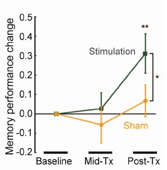
That looks desperately unconvincing to me. The test of significance gives P = 0.043. In an underpowered study like this, the chance of this being a false discovery is probably at least 50%. A result like this means, at most, "worth another look". It does not begin to justify all the hype that surrounded the paper. The journal, the university’s PR department, and ultimately the authors, must bear the responsibility for the unjustified claims.
Science does not allow online comments following the paper, but there are now plenty of sites that do. NHS Choices did a fairly good job of putting the paper into perspective, though they failed to notice the statistical weakness. A commenter on PubPeer noted that Science had recently announced that it would tighten statistical standards. In this case, they failed. The age of post-publication peer review is already reaching maturity
Boost your memory with cocoa
Another glamour journal, Nature Neuroscience, hit the headlines on October 26, 2014, in a paper that was publicised in a Nature podcast and a rather uninformative press release.
"Enhancing dentate gyrus function with dietary flavanols improves cognition in older adults. Brickman et al., Nat Neurosci. 2014. doi: 10.1038/nn.3850.".
The journal helpfully lists no fewer that 89 news items related to this study. Mostly they were something like “Drinking cocoa could improve your memory” (Kat Lay, in The Times). Only a handful of the 89 reports spotted the many problems.
A puff piece from Columbia University’s PR department quoted the senior author, Dr Small, making the dramatic claim that
“If a participant had the memory of a typical 60-year-old at the beginning of the study, after three months that person on average had the memory of a typical 30- or 40-year-old.”
|
Like anything to do with diet, the paper immediately got circulated on Twitter. No doubt most of the people who retweeted the message had not read the (paywalled) paper. The links almost all led to inaccurate press accounts, not to the paper itself. |
|

But some people actually read the paywalled paper and post-publication review soon kicked in. Pubmed Commons is a good site for that, because Pubmed is where a lot of people go for references. Hilda Bastian kicked off the comments there (her comment was picked out by Retraction Watch). Her conclusion was this.
"It’s good to see claims about dietary supplements tested. However, the results here rely on a chain of yet-to-be-validated assumptions that are still weakly supported at each point. In my opinion, the immodest title of this paper is not supported by its contents."
(Hilda Bastian runs the Statistically Funny blog -“The comedic possibilities of clinical epidemiology are known to be limitless”, and also a Scientific American blog about risk, Absolutely Maybe.)
NHS Choices spotted most of the problems too, in "A mug of cocoa is not a cure for memory problems". And so did Ian Musgrave of the University of Adelaide who wrote "Most Disappointing Headline Ever (No, Chocolate Will Not Improve Your Memory)",
Here are some of the many problems.
- The paper was not about cocoa. Drinks containing 900 mg cocoa flavanols (as much as in about 25 chocolate bars) and 138 mg of (−)-epicatechin were compared with much lower amounts of these compounds
- The abstract, all that most people could read, said that subjects were given "high or low cocoa–containing diet for 3 months". Bit it wasn’t a test of cocoa: it was a test of a dietary "supplement".
- The sample was small (37ppeople altogether, split between four groups), and therefore under-powered for detection of the small effect that was expected (and observed)
- The authors declared the result to be "significant" but you had to hunt through the paper to discover that this meant P = 0.04 (hint -it’s 6 lines above Table 1). That means that there is around a 50% chance that it’s a false discovery.
- The test was short -only three months
- The test didn’t measure memory anyway. It measured reaction speed, They did test memory retention too, and there was no detectable improvement. This was not mentioned in the abstract, Neither was the fact that exercise had no detectable effect.
- The study was funded by the Mars bar company. They, like many others, are clearly looking for a niche in the huge "supplement" market,
The claims by the senior author, in a Columbia promotional video that the drink produced "an improvement in memory" and "an improvement in memory performance by two or three decades" seem to have a very thin basis indeed. As has the statement that "we don’t need a pharmaceutical agent" to ameliorate a natural process (aging). High doses of supplements are pharmaceutical agents.
To be fair, the senior author did say, in the Columbia press release, that "the findings need to be replicated in a larger study—which he and his team plan to do". But there is no hint of this in the paper itself, or in the title of the press release "Dietary Flavanols Reverse Age-Related Memory Decline". The time for all the publicity is surely after a well-powered study, not before it.
The high altmetrics score for this paper is yet another blow to the reputation of altmetrics.
One may well ask why Nature Neuroscience and the Columbia press office allowed such extravagant claims to be made on such a flimsy basis.
What’s going wrong?
These two papers have much in common. Elaborate imaging studies are accompanied by poor functional tests. All the hype focusses on the latter. These led me to the speculation ( In Pubmed Commons) that what actually happens is as follows.
- Authors do big imaging (fMRI) study.
- Glamour journal says coloured blobs are no longer enough and refuses to publish without functional information.
- Authors tag on a small human study.
- Paper gets published.
- Hyped up press releases issued that refer mostly to the add on.
- Journal and authors are happy.
- But science is not advanced.
It’s no wonder that Dorothy Bishop wrote "High-impact journals: where newsworthiness trumps methodology".
It’s time we forgot glamour journals. Publish open access on the web with open comments. Post-publication peer review is working
But boycott commercial publishers who charge large amounts for open access. It shouldn’t cost more than about £200, and more and more are essentially free (my latest will appear shortly in Royal Society Open Science).
Follow-up
Hilda Bastian has an excellent post about the dangers of reading only the abstract "Science in the Abstract: Don’t Judge a Study by its Cover"
4 November 2014
I was upbraided on Twitter by Euan Adie, founder of Almetric.com, because I didn’t click through the altmetric symbol to look at the citations "shouldn’t have to tell you to look at the underlying data David" and "you could have saved a lot of Google time". But when I did do that, all I found was a list of media reports and blogs -pretty much the same as Nature Neuroscience provides itself.
More interesting, I found that my blog wasn’t listed and neither was PubMed Commons. When I asked why, I was told "needs to regularly cite primary research. PubMed, PMC or repository links”. But this paper is behind a paywall. So I provide (possibly illegally) a copy of it, so anyone can verify my comments. The result is that altmetric’s dumb algorithms ignore it. In order to get counted you have to provide links that lead nowhere.
So here’s a link to the abstract (only) in Pubmed for the Science paper http://www.ncbi.nlm.nih.gov/pubmed/25170153 and here’s the link for the Nature Neuroscience paper http://www.ncbi.nlm.nih.gov/pubmed/25344629
It seems that altmetrics doesn’t even do the job that it claims to do very efficiently.
It worked. By later in the day, this blog was listed in both Nature‘s metrics section and by altmetrics. com. But comments on Pubmed Commons were still missing, That’s bad because it’s an excellent place for post-publications peer review.
The two posts on this blog about the hazards of s=ignificance testing have proved quite popular. See Part 1: the screening problem, and Part 2: Part 2: the false discovery rate. They’ve had over 20,000 hits already (though I still have to find a journal that will print the paper based on them).
Yet another Alzheiner’s screening story hit the headlines recently and the facts got sorted out in the follow up section of the screening post. If you haven’t read that already, it might be helpful to do so before going on to this post.
This post has already appeared on the Sense about Science web site. They asked me to explain exactly what was meant by the claim that the screening test had an "accuracy of 87%". That was mentioned in all the media reports, no doubt because it was the only specification of the quality of the test in the press release. Here is my attempt to explain what it means.
The "accuracy" of screening tests
Anything about Alzheimer’s disease is front line news in the media. No doubt that had not escaped the notice of Kings College London when they issued a press release about a recent study of a test for development of dementia based on blood tests. It was widely hailed in the media as a breakthrough in dementia research. For example, the BBC report is far from accurate). The main reason for the inaccurate reports is, as so often, the press release. It said
"They identified a combination of 10 proteins capable of predicting whether individuals with MCI would develop Alzheimer’s disease within a year, with an accuracy of 87 percent"
The original paper says
"Sixteen proteins correlated with disease severity and cognitive decline. Strongest associations were in the MCI group with a panel of 10 proteins predicting progression to AD (accuracy 87%, sensitivity 85% and specificity 88%)."
What matters to the patient is the probability that, if they come out positive when tested, they will actually get dementia. The Guardian quoted Dr James Pickett, head of research at the Alzheimer’s Society, as saying
"These 10 proteins can predict conversion to dementia with less than 90% accuracy, meaning one in 10 people would get an incorrect result."
That statement simply isn’t right (or, at least, it’s very misleading). The proper way to work out the relevant number has been explained in many places -I did it recently on my blog.
The easiest way to work it out is to make a tree diagram. The diagram is like that previously discussed here, but with a sensitivity of 85% and a specificity of 88%, as specified in the paper.
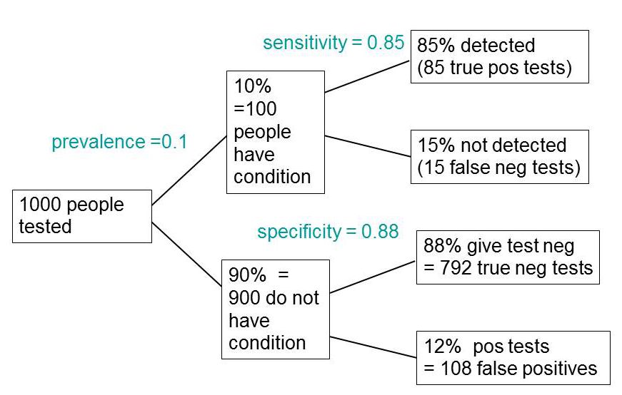
In order to work out the number we need, we have to specify the true prevalence of people who will develop dementia, in the population being tested. In the tree diagram, this has been taken as 10%. The diagram shows that, out of 1000 people tested, there are 85 + 108 = 193 with a positive test result. Out ot this 193, rather more than half (108) are false positives, so if you test positive there is a 56% chance that it’s a false alarm (108/193 = 0.56). A false discovery rate of 56% is far too high for a good test.
This figure of 56% seems to be the basis for a rather good post by NHS Choices with the title “Blood test for Alzheimer’s ‘no better than coin toss’
If the prevalence were taken as 5% (a value that’s been given for the over-60 age group) that fraction of false alarms would rise to a disastrous 73%.
How are these numbers related to the claim that the test is "87% accurate"? That claim was parroted in most of the media reports, and it is why Dr Pickett said "one in 10 people would get an incorrect result".
The paper itself didn’t define "accuracy" anywhere, and I wasn’t familiar with the term in this context (though Stephen Senn pointed out that it is mentioned briefly in the Wiikipedia entry for Sensitivity and Specificity). The senior author confirmed that "accuracy" means the total fraction of tests, positive or negative, that give the right result. We see from the tree diagram that, out of 1000 tests, there are 85 correct positive tests and 792 correct negative tests, so the accuracy (with a prevalence of 0.1) is (85 + 792)/1000 = 88%, close to the value that’s cited in the paper.
Accuracy, defined in this way, seems to me not to be a useful measure at all. It conflates positive and negative results and they need to be kept separate to understand the problem. Inspection of the tree diagram shows that it can be expressed algebraically as
accuracy = (sensitivity × prevalence) + (specificity × (1 − prevalence))
It is therefore merely a weighted mean of sensitivity and specificity (weighted by the prevalence). With the numbers in this case, it varies from 0.88 (when prevalence = 0) to 0.85 (when prevalence = 1). Thus it will inevitably give a much more flattering view of the test than the false discovery rate.
No doubt, it is too much to expect that a hard-pressed journalist would have time to figure this out, though it isn’t clear that they wouldn’t have time to contact someone who understands it. But it is clear that it should have been explained in the press release. It wasn’t.
In fact, reading the paper shows that the test was not being proposed as a screening test for dementia at all. It was proposed as a way to select patients for entry into clinical trials. The population that was being tested was very different from the general population of old people, being patients who come to memory clinics in trials centres (the potential trials population)
How best to select patients for entry into clinical trials is a matter of great interest to people who are running trials. It is of very little interest to the public. So all this confusion could have been avoided if Kings had refrained from issuing a press release at all, for a paper like this.
I guess universities think that PR is more important than accuracy.
That’s a bad mistake in an age when pretentions get quickly punctured on the web.
This post first appeared on the Sense about Science web site.
This post is now a bit out of date: there is a summary of my more recent efforts (papers, videos and pop stuff) can be found on Prof Sivilotti’s OneMol pages.
What follows is a simplified version of part of a paper that appeared as a preprint on arXiv in July. It appeared as a peer-reviewed paper on 19th November 2014, in the new Royal Society Open Science journal. If you find anything wrong, or obscure, please email me. Be vicious.
There is also a simplified version, given as a talk on Youtube..
It’s a follow-up to my very first paper, which was written in 1959 – 60, while I was a fourth year undergraduate(the history is at a recent blog). I hope this one is better.
‘”. . . before anything was known of Lydgate’s skill, the judgements on it had naturally been divided, depending on a sense of likelihood, situated perhaps in the pit of the stomach, or in the pineal gland, and differing in its verdicts, but not less valuable as a guide in the total deficit of evidence” ‘George Eliot (Middlemarch, Chap. 45)
“The standard approach in teaching, of stressing the formal definition of a p-value while warning against its misinterpretation, has simply been an abysmal failure” Sellke et al. (2001) `The American Statistician’ (55), 62–71
The last post was about screening. It showed that most screening tests are useless, in the sense that a large proportion of people who test positive do not have the condition. This proportion can be called the false discovery rate. You think you’ve discovered the condition, but you were wrong.
Very similar ideas can be applied to tests of significance. If you read almost any scientific paper you’ll find statements like “this result was statistically significant (P = 0.047)”. Tests of significance were designed to prevent you from making a fool of yourself by claiming to have discovered something, when in fact all you are seeing is the effect of random chance. In this case we define the false discovery rate as the probability that, when a test comes out as ‘statistically significant’, there is actually no real effect.
You can also make a fool of yourself by failing to detect a real effect, but this is less harmful to your reputation.
It’s very common for people to claim that an effect is real, not just chance, whenever the test produces a P value of less than 0.05, and when asked, it’s common for people to think that this procedure gives them a chance of 1 in 20 of making a fool of themselves. Leaving aside that this seems rather too often to make a fool of yourself, this interpretation is simply wrong.
The purpose of this post is to justify the following proposition.
|
If you observe a P value close to 0.05, your false discovery rate will not be 5%. It will be at least 30% and it could easily be 80% for small studies.
|
This makes slightly less startling the assertion in John Ioannidis’ (2005) article, Why Most Published Research Findings Are False. That paper caused quite a stir. It’s a serious allegation. In fairness, the title was a bit misleading. Ioannidis wasn’t talking about all science. But it has become apparent that an alarming number of published works in some fields can’t be reproduced by others. The worst offenders seem to be clinical trials, experimental psychology and neuroscience, some parts of cancer research and some attempts to associate genes with disease (genome-wide association studies). Of course the self-correcting nature of science means that the false discoveries get revealed as such in the end, but it would obviously be a lot better if false results weren’t published in the first place.
How can tests of significance be so misleading?
Tests of statistical significance have been around for well over 100 years now. One of the most widely used is Student’s t test. It was published in 1908. ‘Student’ was the pseudonym for William Sealy Gosset, who worked at the Guinness brewery in Dublin. He visited Karl Pearson’s statistics department at UCL because he wanted statistical methods that were valid for testing small samples. The example that he used in his paper was based on data from Arthur Cushny, the first holder of the chair of pharmacology at UCL (subsequently named the A.J. Clark chair, after its second holder)
The outcome of a significance test is a probability, referred to as a P value. First, let’s be clear what the P value means. It will be simpler to do that in the context of a particular example. Suppose we wish to know whether treatment A is better (or worse) than treatment B (A might be a new drug, and B a placebo). We’d take a group of people and allocate each person to take either A or B and the choice would be random. Each person would have an equal chance of getting A or B. We’d observe the responses and then take the average (mean) response for those who had received A and the average for those who had received B. If the treatment (A) was no better than placebo (B), the difference between means should be zero on average. But the variability of the responses means that the observed difference will never be exactly zero. So how big does it have to be before you discount the possibility that random chance is all you were seeing. You do the test and get a P value. Given the ubiquity of P values in scientific papers, it’s surprisingly rare for people to be able to give an accurate definition. Here it is.
|
The P value is the probability that you would find a difference as big as that observed, or a still bigger value, if in fact A and B were identical.
|
If this probability is low enough, the conclusion would be that it’s unlikely that the observed difference (or a still bigger one) would have occurred if A and B were identical, so we conclude that they are not identical, i.e. that there is a genuine difference between treatment and placebo.
This is the classical way to avoid making a fool of yourself by claiming to have made a discovery when you haven’t. It was developed and popularised by the greatest statistician of the 20th century, Ronald Fisher, during the 1920s and 1930s. It does exactly what it says on the tin. It sounds entirely plausible.
What could possibly go wrong?
Another way to look at significance tests
One way to look at the problem is to notice that the classical approach considers only what would happen if there were no real effect or, as a statistician would put it, what would happen if the null hypothesis were true. But there isn’t much point in knowing that an event is unlikely when the null hypothesis is true unless you know how likely it is when there is a real effect.
We can look at the problem a bit more realistically by means of a tree diagram, very like that used to analyse screening tests, in the previous post.
In order to do this, we need to specify a couple more things.
First we need to specify the power of the significance test. This is the probability that we’ll detect a difference when there really is one. By ‘detect a difference’ we mean that the test comes out with P < 0.05 (or whatever level we set). So it’s analogous with the sensitivity of a screening test. In order to calculate sample sizes, it’s common to set the power to 0.8 (obviously 0.99 would be better, but that would often require impracticably large samples).
The second thing that we need to specify is a bit trickier, the proportion of tests that we do in which there is a real difference. This is analogous to the prevalence of the disease in the population being tested in the screening example. There is nothing mysterious about it. It’s an ordinary probability that can be thought of as a long-term frequency. But it is a probability that’s much harder to get a value for than the prevalence of a disease.
If we were testing a series of 30C homeopathic pills, all of the pills, regardless of what it says on the label, would be identical with the placebo controls so the prevalence of genuine effects, call it P(real), would be zero. So every positive test would be a false positive: the false discovery rate would be 100%. But in real science we want to predict the false discovery rate in less extreme cases.
Suppose, for example, that we test a large number of candidate drugs. Life being what it is, most of them will be inactive, but some will have a genuine effect. In this example we’d be lucky if 10% had a real effect, i.e. were really more effective than the inactive controls. So in this case we’d set the prevalence to P(real) = 0.1.
We can now construct a tree diagram exactly as we did for screening tests.
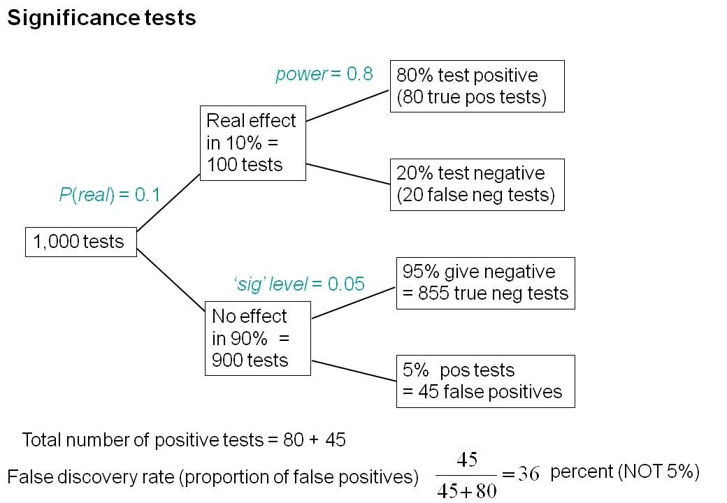
Suppose that we do 1000 tests. In 90% of them (900 tests) there is no real effect: the null hypothesis is true. If we use P = 0.05 as a criterion for significance then, according to the classical theory, 5% of them (45 tests) will give false positives, as shown in the lower limb of the tree diagram. If the power of the test was 0.8 then we’ll detect 80% of the real differences so there will be 80 correct positive tests.
The total number of positive tests is 45 + 80 = 125, and the proportion of these that are false positives is 45/125 = 36 percent. Our false discovery rate is far bigger than the 5% that many people still believe they are attaining.
In contrast, 98% of negative tests are right (though this is less surprising because 90% of experiments really have no effect).
The equation
You can skip this section without losing much.
As in the case of screening tests, this result can be calculated from an equation. The same equation works if we substitute power for sensitivity, P(real) for prevalence, and siglev for (1 – specificity) where siglev is the cut off value for “significance”, 0.05 in our examples.
The false discovery rate (the probability that, if a “signifcant” result is found, there is actually no real effect) is given by
\[FDR = \frac{siglev\left(1-P(real)\right)}{power.P(real) + siglev\left(1-P(real)\right) }\; \]
In the example above, power = 0.8, siglev = 0.05 and P(real) = 0.1, so the false discovery rate is
\[\frac{0.05 (1-0.1)}{0.8 \times 0.1 + 0.05 (1-0.1) }\; = 0.36 \]
So 36% of “significant” results are wrong, as found in the tree diagram.
Some subtleties
The argument just presented should be quite enough to convince you that significance testing, as commonly practised, will lead to disastrous numbers of false positives. But the basis of how to make inferences is still a matter that’s the subject of intense controversy among statisticians, so what is an experimenter to do?
It is difficult to give a consensus of informed opinion because, although there is much informed opinion, there is rather little consensus. A personal view follows. Colquhoun (1970), Lectures on Biostatistics, pp 94-95.
This is almost as true now as it was when I wrote it in the late 1960s, but there are some areas of broad agreement.
There are two subtleties that cause the approach outlined above to be a bit contentious. The first lies in the problem of deciding the prevalence, P(real). You may have noticed that if the frequency of real effects were 50% rather than 10%, the approach shown in the diagram would give a false discovery rate of only 6%, little different from the 5% that’s embedded in the consciousness of most experimentalists.
But this doesn’t get us off the hook, for two reasons. For a start, there is no reason at all to think that there will be a real effect there in half of the tests that we do. Of course if P(real) were even bigger than 0.5, the false discovery rate would fall to zero, because when P(real) = 1, all effects are real and therefore all positive tests are correct.
There is also a more subtle point. If we are trying to interpret the result of a single test that comes out with a P value of, say, P = 0.047, then we should not be looking at all significant results (those with P < 0.05), but only at those tests that come out with P = 0.047. This can be done quite easily by simulating a long series of t tests, and then restricting attention to those that come out with P values between, say, 0.045 and 0.05. When this is done we find that the false discovery rate is at least 26%. That’s for the best possible case where the sample size is good (power of the test is 0.8) and the prevalence of real effects is 0.5. When, as in the tree diagram, the prevalence of real effects is 0.1, the false discovery rate is 76%. That’s enough to justify Ioannidis’ statement that most published results are wrong.
One problem with all of the approaches mentioned above was the need to guess at the prevalence of real effects (that’s what a Bayesian would call the prior probability). James Berger and colleagues (Sellke et al., 2001) have proposed a way round this problem by looking at all possible prior distributions and so coming up with a minimum false discovery rate that holds universally. The conclusions are much the same as before. If you claim to have found an effects whenever you observe a P value just less than 0.05, you will come to the wrong conclusion in at least 29% of the tests that you do. If, on the other hand, you use P = 0.001, you’ll be wrong in only 1.8% of cases. Valen Johnson (2013) has reached similar conclusions by a related argument.
A three-sigma rule
As an alternative to insisting on P < 0.001 before claiming you’ve discovered something, you could use a 3-sigma rule. In other words, insist that an effect is at least three standard deviations away from the control value (as opposed to the two standard deviations that correspond to P = 0.05).
The three sigma rule means using P= 0.0027 as your cut off. This, according to Berger’s rule, implies a false discovery rate of (at least) 4.5%, not far from the value that many people mistakenly think is achieved by using P = 0.05 as a criterion.
Particle physicists go a lot further than this. They use a 5-sigma rule before announcing a new discovery. That corresponds to a P value of less than one in a million (0.57 x 10⁻⁶). According to Berger’s rule this corresponds to a false discovery rate of (at least) around 20 per million. Of course their experiments can’t be randomised usually, so it’s as well to be on the safe side.
Underpowered experiments
All of the problems discussed so far concern the near-ideal case. They assume that your sample size is big enough (power about 0.8 say) and that all of the assumptions made in the test are true, that there is no bias or cheating and that no negative results are suppressed. The real-life problems can only be worse. One way in which it is often worse is that sample sizes are too small, so the statistical power of the tests is low.
The problem of underpowered experiments has been known since 1962, but it has been ignored. Recently it has come back into prominence, thanks in large part to John Ioannidis and the crisis of reproducibility in some areas of science. Button et al. (2013) said
“We optimistically estimate the median statistical power of studies in the neuroscience field to be between about 8% and about 31%”
This is disastrously low. Running simulated t tests shows that with a power of 0.2, not only do you have only a 20% chance of detecting a real effect, but that when you do manage to get a “significant” result there is a 76% chance that it’s a false discovery.
And furthermore, when you do find a “significant” result, the size of the effect will be over-estimated by a factor of nearly 2. This “inflation effect” happens because only those experiments that happen, by chance, to have a larger-than-average effect size will be deemed to be “significant”.
What should you do to prevent making a fool of yourself?
The simulated t test results, and some other subtleties, will be described in a paper, and/or in a future post. But I hope that enough has been said here to convince you that there are real problems in the sort of statistical tests that are universal in the literature.
The blame for the crisis in reproducibility has several sources.
One of them is the self-imposed publish-or-perish culture, which values quantity over quality, and which has done enormous harm to science.
The mis-assessment of individuals by silly bibliometric methods has contributed to this harm. Of all the proposed methods, altmetrics is demonstrably the most idiotic. Yet some vice-chancellors have failed to understand that.
Another is scientists’ own vanity, which leads to the PR department issuing disgracefully hyped up press releases.
In some cases, the abstract of a paper states that a discovery has been made when the data say the opposite. This sort of spin is common in the quack world. Yet referees and editors get taken in by the ruse (e.g see this study of acupuncture).
The reluctance of many journals (and many authors) to publish negative results biases the whole literature in favour of positive results. This is so disastrous in clinical work that a pressure group has been started; altrials.net “All Trials Registered | All Results Reported”.
Yet another problem is that it has become very hard to get grants without putting your name on publications to which you have made little contribution. This leads to exploitation of young scientists by older ones (who fail to set a good example). Peter Lawrence has set out the problems.
And, most pertinent to this post, a widespread failure to understand properly what a significance test means must contribute to the problem. Young scientists are under such intense pressure to publish, they have no time to learn about statistics.
Here are some things that can be done.
- Notice that all statistical tests of significance assume that the treatments have been allocated at random. This means that application of significance tests to observational data, e.g. epidemiological surveys of diet and health, is not valid. You can’t expect to get the right answer. The easiest way to understand this assumption is to think about randomisation tests (which should have replaced t tests decades ago, but which are still rare). There is a simple introduction in Lectures on Biostatistics (chapters 8 and 9). There are other assumptions too, about the distribution of observations, independence of measurements), but randomisation is the most important.
- Never, ever, use the word “significant” in a paper. It is arbitrary, and, as we have seen, deeply misleading. Still less should you use “almost significant”, “tendency to significant” or any of the hundreds of similar circumlocutions listed by Matthew Hankins on his Still not Significant blog.
- If you do a significance test, just state the P value and give the effect size and confidence intervals (but be aware that this is just another way of expressing the P value approach: it tells you nothing whatsoever about the false discovery rate).
- Observation of a P value close to 0.05 means nothing more than ‘worth another look’. In practice, one’s attitude will depend on weighing the losses that ensue if you miss a real effect against the loss to your reputation if you claim falsely to have made a discovery.
- If you want to avoid making a fool of yourself most of the time, don’t regard anything bigger than P < 0.001 as a demonstration that you’ve discovered something. Or, slightly less stringently, use a three-sigma rule.
Despite the gigantic contributions that Ronald Fisher made to statistics, his work has been widely misinterpreted. We must, however reluctantly, concede that there is some truth in the comment made by an astute journalist:
“The plain fact is that 70 years ago Ronald Fisher gave scientists a mathematical machine for turning baloney into breakthroughs, and °flukes into funding. It is time to pull the plug“. Robert Matthews Sunday Telegraph, 13 September 1998.
There is now a video on YouTube that attempts to explain explain simply the essential ideas. The video has now been updated. The new version has better volume and it used term ‘false positive risk’, rather than the earlier term ‘false discovery rate’, to avoid confusion with the use of the latter term in the context of multiple comparisons.
The false positive risk: a proposal concerning what to do about p-values (version 2)
Follow-up
31 March 2014 I liked Stephen Senn’s first comment on twitter (the twitter stream is storified here). He said ” I may have to write a paper ‘You may believe you are NOT a Bayesian but you’re wrong'”. I maintain that the analysis here is merely an exercise in conditional probabilities. It bears a formal similarity to a Bayesian argument, but is free of more contentious parts of the Bayesian approach. This is amplified in a comment, below.
4 April 2014
I just noticed that my first boss, Heinz Otto Schild.in his 1942 paper about the statistical analysis of 2+2 dose biological assays (written while he was interned at the beginning of the war) chose to use 99% confidence limits, rather than the now universal 95% limits. The later are more flattering to your results, but Schild was more concerned with precision than self-promotion.
This post is about why screening healthy people is generally a bad idea. It is the first in a series of posts on the hazards of statistics.
There is nothing new about it: Graeme Archer recently wrote a similar piece in his Telegraph blog. But the problems are consistently ignored by people who suggest screening tests, and by journals that promote their work. It seems that it can’t be said often enough.
The reason is that most screening tests give a large number of false positives. If your test comes out positive, your chance of actually having the disease is almost always quite small. False positive tests cause alarm, and they may do real harm, when they lead to unnecessary surgery or other treatments.
Tests for Alzheimer’s disease have been in the news a lot recently. They make a good example, if only because it’s hard to see what good comes of being told early on that you might get Alzheimer’s later when there are no good treatments that can help with that news. But worse still, the news you are given is usually wrong anyway.
Consider a recent paper that described a test for "mild cognitive impairment" (MCI), a condition that may, but often isn’t, a precursor of Alzheimer’s disease. The 15-minute test was published in the Journal of Neuropsychiatry and Clinical Neurosciences by Scharre et al (2014). The test sounded pretty good. It had a specificity of 95% and a sensitivity of 80%.
Specificity (95%) means that 95% of people who are healthy will get the correct diagnosis: the test will be negative.
Sensitivity (80%) means that 80% of people who have MCI will get the correct diagnosis: the test will be positive.
To understand the implication of these numbers we need to know also the prevalence of MCI in the population that’s being tested. That was estimated as 1% of people have MCI. Or, for over-60s only, 5% of people have MCI. Now the calculation is easy. Suppose 10.000 people are tested. 1% (100 people) will have MCI, of which 80% (80 people) will be diagnosed correctly. And 9,900 do not have MCI, of which 95% will test negative (correctly). The numbers can be laid out in a tree diagram.
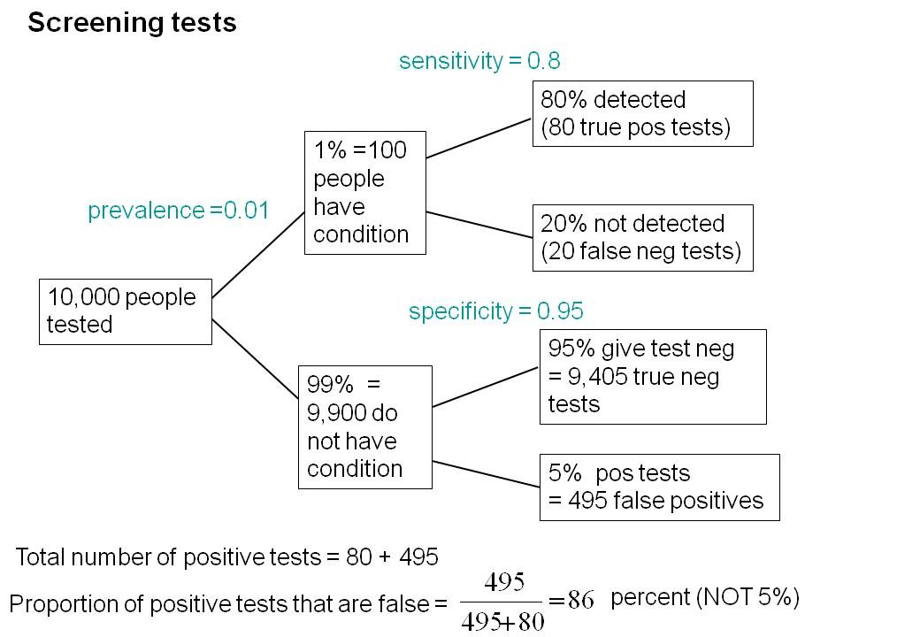
The total number of positive tests is 80 + 495 = 575, of which 495 are false positives. The fraction of tests that are false positives is 495/575= 86%.
Thus there is a 14% chance that if you test positive, you actually have MCI. 86% of people will be alarmed unnecessarily.
Even for people over 60. among whom 5% of the population have MC!, the test is gives the wrong result (54%) more often than it gives the right result (46%).
The test is clearly worse than useless. That was not made clear by the authors, or by the journal. It was not even made clear by NHS Choices.
It should have been.
It’s easy to put the tree diagram in the form of an equation. Denote sensitivity as sens, specificity as spec and prevalence as prev.
The probability that a positive test means that you actually have the condition is given by
\[\frac{sens.prev}{sens.prev + \left(1-spec\right)\left(1-prev\right) }\; \]
In the example above, sens = 0.8, spec = 0.95 and prev = 0.01, so the fraction of positive tests that give the right result is
\[\frac{0.8 \times 0.01}{0.8 \times 0.01 + \left(1 – 0.95 \right)\left(1 – 0.01\right) }\; = 0.139 \]
So 13.9% of positive tests are right, and 86% are wrong, as found in the tree diagram.
The lipid test for Alzheimers’
Another Alzheimers’ test has been in the headlines very recently. It performs even worse than the 15-minute test, but nobody seems to have noticed. It was published in Nature Medicine, by Mapstone et al. (2014). According to the paper, the sensitivity is 90% and the specificity is 90%, so, by constructing a tree, or by using the equation, the probability that you are ill, given that you test positive is a mere 8% (for a prevalence of 1%). And even for over-60s (prevalence 5%), the value is only 32%, so two-thirds of positive tests are still wrong. Again this was not pointed out by the authors. Nor was it mentioned by Nature Medicine in its commentary on the paper. And once again, NHS Choices missed the point.
Why does there seem to be a conspiracy of silence about the deficiencies of screening tests? It has been explained very clearly by people like Margaret McCartney who understand the problems very well. Is it that people are incapable of doing the calculations? Surely not. Is it that it’s better for funding to pretend you’ve invented a good test, when you haven’t? Do journals know that anything to do with Alzheimers’ will get into the headlines, and don’t want to pour cold water on a good story?
Whatever the explanation, it’s bad science that can harm people.
Follow-up
March 12 2014. This post was quickly picked up by the ampp3d blog, run by the Daily Mirror. Conrad Quilty-Harper showed some nice animations under the heading How a “90% accurate” Alzheimer’s test can be wrong 92% of the time.
March 12 2014.
As so often, the journal promoted the paper in a way that wasn’t totally accurate. Hype is more important than accuracy, I guess.
June 12 2014.
The empirical evidence shows that “general health checks” (a euphemism for mass screening of the healthy) simply don’t help. See review by Gøtzsche, Jørgensen & Krogsbøll (2014) in BMJ. They conclude
“Doctors should not offer general health checks to their patients,and governments should abstain from introducing health check programmes, as the Danish minister of health did when she learnt about the results of the Cochrane review and the Inter99 trial. Current programmes, like the one in the United Kingdom,should be abandoned.”
8 July 2014
Yet another over-hyped screening test for Alzheimer’s in the media. And once again. the hype originated in the press release, from Kings College London this time. The press release says
"They identified a combination of 10 proteins capable of predicting whether individuals with MCI would develop Alzheimer’s disease within a year, with an accuracy of 87 percent"
The term “accuracy” is not defined in the press release. And it isn’t defined in the original paper either. I’ve written to senior author, Simon Lovestone to try to find out what it means. The original paper says
"Sixteen proteins correlated with disease severity and cognitive decline. Strongest associations were in the MCI group with a panel of 10 proteins predicting progression to AD (accuracy 87%, sensitivity 85% and specificity 88%)."
A simple calculation, as shown above, tells us that with sensitivity 85% and specificity 88%. the fraction of people who have a positive test who are diagnosed correctly is 44%. So 56% of positive results are false alarms. These numbers assume that the prevalence of the condition in the population being tested is 10%, a higher value than assumed in other studies. If the prevalence were only 5% the results would be still worse: 73% of positive tests would be wrong. Either way, that’s not good enough to be useful as a diagnostic method.
In one of the other recent cases of Alzheimer’s tests, six months ago, NHS Choices fell into the same trap. They changed it a bit after I pointed out the problem in the comments. They seem to have learned their lesson because their post on this study was titled “Blood test for Alzheimer’s ‘no better than coin toss’ “. That’s based on the 56% of false alarms mention above.
The reports on BBC News and other media totally missed the point. But, as so often, their misleading reports were based on a misleading press release. That means that the university, and ultimately the authors, are to blame.
I do hope that the hype has no connection with the fact that Conflicts if Interest section of the paper says
"SL has patents filed jointly with Proteome Sciences plc related to these findings"
What it doesn’t mention is that, according to Google patents, Kings College London is also a patent holder, and so has a vested interest in promoting the product.
Is it really too much to expect that hard-pressed journalists might do a simple calculation, or phone someone who can do it for them? Until that happens, misleading reports will persist.
9 July 2014
It was disappointing to see that the usually excellent Sarah Boseley in the Guardian didn’t spot the problem either. And still more worrying that she quotes Dr James Pickett, head of research at the Alzheimer’s Society, as saying
These 10 proteins can predict conversion to dementia with less than 90% accuracy, meaning one in 10 people would get an incorrect result.
That number is quite wrong. It isn’t 1 in 10, it’s rather more than 1 in 2.
A resolution
After corresponding with the author, I now see what is going on more clearly.
The word "accuracy" was not defined in the paper, but was used in the press release and widely cited in the media. What it means is the ratio of the total number of true results (true positives + true negatives) to the total number of all results. This doesn’t seem to me to be useful number to give at all, because it conflates false negatives and false positives into a single number. If a condition is rare, the number of true negatives will be large (as shown above), but this does not make it a good test. What matters most to patients is not accuracy, defined in this way, but the false discovery rate.
The author makes it clear that the results are not intended to be a screening test for Alzheimer’s. It’s obvious from what’s been said that it would be a lousy test. Rather, the paper was intended to identify patients who would eventually (well, within only 18 months) get dementia. The denominator (always the key to statistical problems) in this case is the highly atypical patients that who come to memory clinics in trials centres (the potential trials population). The prevalence in this very restricted population may indeed be higher that the 10 percent that I used above.
Reading between the lines of the press release, you might have been able to infer some of thus (though not the meaning of “accuracy”). The fact that the media almost universally wrote up the story as a “breakthrough” in Alzeimer’s detection, is a consequence of the press release and of not reading the original paper.
I wonder whether it is proper for press releases to be issued at all for papers like this, which address a narrow technical question (selection of patients for trials). That us not a topic of great public interest. It’s asking for misinterpretation and that’s what it got.
I don’t suppose that it escaped the attention of the PR people at Kings that anything that refers to dementia is front page news, whether it’s of public interest or not. When we had an article in Nature in 2008, I remember long discussions about a press release with the arts graduate who wrote it (not at our request). In the end we decides that the topic was not of sufficient public interest to merit a press release and insisted that none was issued. Perhaps that’s what should have happened in this case too.
This discussion has certainly illustrated the value of post-publication peer review. See, especially, the perceptive comments, below, from Humphrey Rang and from Dr Aston and from Dr Kline.
14 July 2014. Sense about Science asked me to write a guest blog to explain more fully the meaning of "accuracy", as used in the paper and press release. It’s appeared on their site and will be reposted on this blog soon.
Last year, I was sent my answer paper for one of my final exams, taken in 1959. This has triggered a bout of shamelessly autobiographical nostalgia.
|
The answer sheets that I wrote had been kept by one of my teachers at Leeds, Dr George Mogey. After he died in 2003, aged 86, his widow, Audrey, found them and sent them to me. And after a hunt through the junk piled high in my office, I found the exam papers from that year too. George Mogey was an excellent teacher and a kind man. He gave most of the lectures to medical students, which we, as pharmacy/pharmacology students attended. His lectures were inspirational. |
 Photo from his daughter, Nora Mogey |
|
Today, 56 years on, I can still recall vividly his lecture on anti-malarial drugs. At the end he paused dramatically and said “Since I started speaking, 100 people have died from malaria” (I don’t recall the exact number). He was the perfect antidote to people who say you learn nothing from lectures. Straight after the war (when he had seen the problem of malaria at first hand) he went to work at the Wellcome Research Labs in Beckenham, Kent. The first head of the Wellcome Lab was Henry Dale. It had a distinguished record of basic research as well as playing a crucial role in vaccine production and in development of the safe use of digitalis. In the 1930s it had an important role in the development of proper methods for biological standardisation. This was crucial for ensuring that, for example, each batch of tincture ot digitalis had the same potency (it has been described previously on this blog in Plants as Medicines. |
 |
|
When George Mogey joined the Wellcome lab, its head was J.W. Trevan (1887 – 1956) (read his Biographical Memoir, written by J.H. Gaddum). Trevan’s most memorable contributions were in improving the statistics of biological assays. The ideas of individual effective dose and median effective dose were developed by him. His 1927 paper The Error of Determination of Toxicity is a classic of pharmacology. His advocacy of the well-defined quantity, median effective dose as a replacement for the ill-defined minimum effective dose was influential in the development of proper statistical analysis of biological assays in the 1930s. |
 |
Trevan is something of hero to me. And he was said to be very forgetful. Gaddum, in his biographical memoir, recounts this story
“One day when he had lost something and suspected that it had been tidied away by his secretary, he went round muttering ‘It’s all due to this confounded tidiness. It always leads to trouble. I won’t have it in my lab.’ “
|
Trevan coined the abbreviation LD50 for the median lethal dose of a drug. George Mogey later acquired the car number plate LD50, in honour of Trevan, and his widow, Audrey, still has it (picture on right). |
 |
Mogey wrote several papers with Trevan. In 1948 he presented one at a meeting of the Physiological Society. The programme included also A.V. Hill. E.J Denton, Bernhard [sic] Katz, J.Z. Young and Richard Keynes (Keynes was George Henry Lewes Student at Cambridge: Lewes was the Victorian polymath with whom the novelist George Eliot lived, openly unmarried, and a founder of the Physiological Society. He probably inspired the medical content of Eliot’s best known novel, Middlemarch).
|
Mogey may not have written many papers, but he was the sort of inspiring teacher that universities need. He had a letter in Nature on Constituents of Amanita Muscaria, the fly agaric toadstool, which appeared in 1965. That might explain why we went on a toadstool-hunting field trip. |
 Amanita muscaria DC picture, 2005 |
The tradition of interest in statistics and biological assay must have rubbed off on me, because the answers I gave in the exam were very much in that tradition. Here is a snippet (click to download the whole answer sheet).
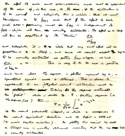
A later answer was about probit analysis, an idea introduced by statistician Chester Bliss (1899–1979) in 1934, as an direct extension of Trevan’s work. (I met Bliss in 1970 or 1971 when I was in Yale -we had dinner, went to a theatre -then back to his apartment where he insisted on showing me his collection of erotic magazines!)
This paper was a pharmacology paper in my first final exam at the end of my third year. The external examiner was Walter Perry, head of pharmacology in Edinburgh (he went on to found the Open University). He had previously been head of Biological Standards at the National Institute for Medical Research, a job in which he had to know some statistics. In the oral exam he asked me a killer question “What is the difference between confidence limits and fiducial limits?”. I had no real idea (and, as I discovered later, neither did he). After that, I went on to do the 4th year where we specialised in pharmacology, and I spent quite a lot of time trying to answer that question. The result was my first ever paper, published in the University of Leeds Medical Journal. I hinted, obliquely, that the idea of fiducial inference was probably Ronald Fisher‘s only real mistake. I think that is the general view now, but Fisher was such a towering figure in statistics that nobody said that straight out (he was still alive when this was written -he died in 1962).
It is well-worth looking at a paper that Fisher gave to the Royal Statistical Society in 1935, The Logic of Inductive Inference. Then, as now, it was the custom for a paper to be followed by a vote of thanks, and a seconder. These, and the subsequent discussion, are all printed, and they could be quite vicious in a polite way. Giving the vote of thanks, Professor A.L. Bowley said
“It is not the custom, when the Council invites a member to propose a vote of thanks on a paper, to instruct him to bless it. If to some extent I play the inverse role of Balaam, it is not without precedent;”
And the seconder, Dr Isserlis, said
“There is no doubt in my mind at all about that, but Professor Fisher, like other fond parents, may perhaps see in his offspring qualities which to his mind no other children possess; others, however, may consider that the offspring are not unique.”
Post-publication peer review was already alive and well in 1935.
I was helped enormously in writing this paper by Dr B.L.Welch (1911 – 1989), whose first year course in statistics for biologists was a compulsory part of the course. Welch was famous particularly for having extended Student’s t distribution to the case where the variances in two samples being compared are unequal (Welch, 1947). He gave his whole lecture with his back to the class while writing what he said on a set of blackboards that occupied the whole side of the room. No doubt he would have failed any course about how to give a lecture. I found him riveting. He went slowly, and you could always check your notes because it was all there on the blackboards.
Walter Perry seemed to like my attempt to answer his question, despite the fact that it failed. After the 4th year final (a single 3 hour essay on drugs that affect protein synthesis) he offered me a PhD place in Edinburgh. He was one of my supervisors, though I never saw him except when he dropped into the lab for a cigarette between committee meetings. While in Edinburgh I met the famous statistician. David Finney, whose definitive book on the Statistics of Biological Assay was an enormous help when I later wrote Lectures on Biostatistics and a great help in getting my first job at UCL in 1964. Heinz Otto Schild. then the famous head of department, had written a paper in 1942 about the statistical analysis of 2+2 dose biological assays, while interned at the beginning of the war. He wanted someone to teach it to students, so he gave me a job. That wouldn’t happen now, because that sort of statistics would be considered too difficult Incidentally, I notice that Schild uses 99% confidence limits in his paper, not the usual 95% limits which make your results look better
It was clear even then, that the basis of statistical inference was an exceedingly contentious matter among statisticians. It still is, but the matter has renewed importance in view of the crisis of reproducibility in science. The question still fascinates me, and I’m planning to update my first paper soon. This time I hope it will be a bit better.
Postscript: some old pictures
While in nostalgic mood, here are a few old pictures. First, the only picture I have from undergraduate days. It was taken on a visit to May and Baker (of sulphonamide fame) in February 1957 (so I must have been in my first year). There were 15 or so in the class for the first three years (now, you can get 15 in a tutorial group). I’m in the middle of the back row (with hair!). The only names that I recall are those of the other two who went into the 4th year with me, Ed Abbs (rightmost on back row) and Stella Gregory (2nd from right, front row). Ed died young and Stella went to Australia. Just in front of me are James Dare (with bow tie) and Mr Nelson (who taught old fashioned pharmacognosy).

|
James Dare taught pharmaceutics, but he also had a considerable interest in statistics and we did lots of calculations with electromechanical calculators -the best of them was a Monroe (here’s a picture of one with the case removed to show the amazingly intricate mechanism). |
>
Monroe 8N-213 from http://www.science.uva.nl/museum/calclist.php |

The history of UCL’s pharmacology goes back to 1905. For most of that time, it’s been a pretty good department. It got top scores in all the research assessments until it was abolished by Malcolm Grant in 2007. That act of vandalism is documented in my diary section.
For most of its history, there was one professor who was head of the department. That tradition ended in 1983,when Humphrey Rang left for Novartis. The established chair was then empty for two years, until Donald Jenkinson, then head of department, insisted with characteristic modesty, that I rather than he should take the chair. Some time during the subsequent reign of David Brown, it was decided to name the chairs, and mine became the A.J. Clark chair. It was decided that the headship of the department would rotate, between Donald, David Brown and me. But when it came to my turn, I decided I was much too interested in single ion channels to spend time pushing paper, and David Brown nobly extended his term. The A.J. Clark chair was vacant after I ‘retired’ in 2004, but in 2014, Lucia Sivilotti was appointed to the chair, a worthy successor in its quantitative tradition.
The first group picture of UCL’s Pharmacology department was from 1972. Heinz Schild is in the middle of the front row, with Desmond Laurence on his left. Between them they dominated the textbook market: Schild edited A.J. Clark’s Pharmacology (now known as Rang and Dale). Laurence wrote a very successful text, Clinical Pharmacology. Click on the picture for a bigger version, with names, as recalled by Donald Jenkinson: (DHJ). I doubt whether many people now remember Ada Corbett (the tea lady) or Frank Ballhatchet from the mechanical workshop. He could do superb work, though the price was to spent 10 minutes chatting about his Land Rover, or listening to reminiscences of his time working on Thames barges. I still have a beautiful 8-way tap that he made. with a jerk-free indexing mechanism.

The second Departmental picture was taken in June 1980. Humphrey Rang was head of department then. My colleagues David Ogden and Steven Siegelbaum are there. In those days we had a tea lady too, Joyce Mancini. (Click pictures to enlarge)
Follow-up
A new study of the effects of eating red meat and processed meat got a lot of publicity. When I wrote about this in 2009, I concluded that the evidence for harm was pretty shaky. Is there reason to change my mind?
The BBC’s first report on 12 March was uncritical (though at least it did link to the original paper -big improvement). On 16th March, Ruth Alexander did a lot better, after asking renowned risk expert, David Spiegelhalter. You can hear him talk about it on Tim Harford’s excellent More or Less programme. [Listen to the podcast].
David Spiegelhalter has already written an excellent article about the new work. Here’s my perspective. We’ll see how you can do the calculations yourself.
The new paper was published on Archives of Internal Medicine [get reprint: pdf]. It looked at the association between red meat intake and mortality in two very large cohort studies, the Health Professionals Follow-up Study and the Nurses’ Health Study.
How big are the risks from red meat?
First, it cannot be said too often that studies such as these observe a cohort of people and see what happens to those people who have chosen to eat red meat. If it were the high calorie intake rather than eating meat that causes the risk, then stopping eating meat won’t help you in the slightest. The evidence for causality is reconsidered below.
The new study reported a relative risk of death from any cause were 1.13 for one 85 g serving of red meat per day, and 1.20 for processed meat. For death from cardiovascular disease the risks were a slightly higher, 1.18 for read meat and 1.21 for processed meat, For dying from cancer the relative risks were a bit lower, 1.10 for red meat and 1.16 for processed meat.
A relative risk of 1.13 means that if you eat 85 g of red meat every a day, roughly a hamburger for lunch, your risk of dying in some specified period, e.g. during the next year, is 13 percent higher than that for a similar person who doesn’t eat the hamburgers.
Let’s suppose, for the sake of argument, that the relationship is entirely causal. This is the worst case (or perhaps the best case, because there would be something you could do). How big are your risks? Here are several ways of looking at the risk of eating a hamburger every day (thanks to David Speigelhalter for most of these). Later we’ll see how you can calculate results like these for yourself.
- If you eat a hamburger every day, your risk of dying, e.g in the coming year, is 13 percent higher than for a similar person who doesn’t eat hamburgers.
- In the UK there were around 50 cases of colorectal cancer per 100,000 population in 2008, so a 10% increase, even if it were real, and genuinely causative. would result in 55 rather than 50 cases per 100,000 people, annually.
- But if we look at the whole population there were 22,000 cases of colorectal cancer in the UK in 2009. A 10% increase would mean, if the association were causal, about 2200 extra cases per year as a result of eating hamburgers (but no extra cases if the association were not causal).
- Eating a hamburger a day shortens your life expectancy from 80 years to 79 years (sounds rather small)
- Eating a hamburger a day shortens your life by about half an hour a day, if you start at age 40 (sounds quite serious)
- The effect on life expectancy is similar to that of smoking 2 cigarettes a day or of being 5 Kg overweight (sounds less serious).
- The chance that the hamburger eater will die before the similar non-hamburger eater is 53 percent (compared with 50 percent for two similar people) (sounds quite trivial).
Clearly it isn’t easy to appreciate the size of the risk. Some ways of expressing the same thing sound much more serious than others. Only the first was given in the paper, and in the newspaper reports.
The results. Is there any improvement in the evidence for causality?
The risks reported in the new study are a bit lower than in the WCRF report (2007) which estimated a relative risk of dying from colorectal cancer as 1.21 (95% Confidence interval 1.04–1.42) with 50 g of red or processed meat per day, whereas in the new study the relative risk for cancer was only 1.10 (1.06-1.14) for a larger ‘dose’, 85 g of red meat, or 1.16 (1.09-1.23) for processed meat.
A 2010 update on the 2007 WCRF report also reported a similar lower relative risk for colorectal cancer of 1.16 for 100 g/day of red or processed meat This reduction in size of the effect as samples get bigger is exactly what’s expected for spurious correlations, as described by Ioannidis and others.
One reason that I was so sceptical about causality in the earlier reports was that there was very little evidence of a relationship between the amount of meat eaten (the dose) and the risk of dying (the response), though the reports suggested otherwise. The new study does seem to show a shallow relationship between dose and response, the response being the relative risk (or hazard ratio) for dying (from any cause).
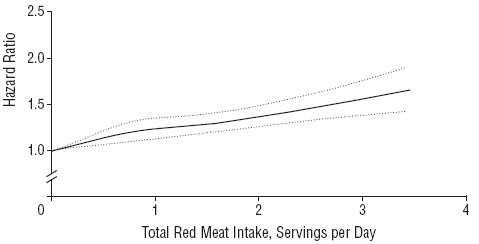
The Figure shows the relationship in the Nurses’ Health Study (it was similar for the other study). The dotted lines are 95% confidence limits (see here), and the lower limit seems to rule out a horizontal line, so the evidence for a relationship between dose and response is better than before, But that doesn’t mean that there is necessarily a causal relationship.
There are two important problems to consider. The legend to the figure says (omittng some details) that
"The results were adjusted for age; body mass index; alcohol consumption, physical activity level, smoking status ; race (white or nonwhite); menopausal status and hormone use in women, family history of diabetes mellitus, myocardial infarction, or cancer; history of diabetes mellitus, hypertension, or hypercholesterolemia; and intakes of total energy, whole grains, fruits, and vegetables."
So the data in the graph aren’t raw observations but they’ve been through a mathematical mill. The corrections are absolutely essential, For example, Table 1 in the paper shows that the 20% of people who eat the most red meat had almost twice the total calorie intake of those who eat the least red meat. So without a correction there would be no way to tell whether it was high calorie intake or eating red meat that was causing an increased risk of death. Likewise, those who eat more red meat also smoke more, drink more alcohol, are heavier (higher body mass index) and take less exercise.
Clearly everything depends on the accuracy of the corrections for total calorie intake etc. It was done by a method called the Cox proportional hazard multiple linear regression. Like any other method that makes assumptions, and there is no easy way to check on how accurate the corrections are. But it is known "that studies on colon cancer that adjusted for larger number of covarariates reported weaker risk ratios than studies which adjusted for a smaller number". The main problem is that there may be some other factor that has not been included in the corrections. Spiegelhalter points out
"Maybe there’s some other factor that both encourages Mike to eat more meat, and leads to a shorter life.
It is quite plausible that income could be such a factor – lower income in the US is both associated with eating red meat and reduced life-expectancy, even allowing for measurable risk factors."
How to do the calculations of risk.
Now we come to the nerdy bit. Calculations of risk of the sort listed above can be done for any relative risk, and here’s how.
The effect on life expectancy is the hardest thing to calculate. To do that you need the actuaries’ life table. You can download the tables from the Office of National Statistics. The calculations were based on the “England and Wales, Interim Life Tables, 1980-82 to 2008-10“. Click on the worksheet for 2008 – 10 (tabs at the bottom). There are two tables there, one for males, one for females. I copied the data for males into a new spreadsheet, which, unlike that from ONS, is live [download live spreadsheet]. There is an explanation of what each column means at the bottom of the worksheet, with a description of the calculation method. In the spreadsheet, the data pasted from the full table are on the left.
and lower down we see life expectancy, $ e_x $, from age 40 is 39.8 years
On the right is an extended life table which is live. You enter into cell H5 any relative risk (hazard ratio), and the table recalculates itself.
Lower down, we see that life expectancy from age 40 with risk ratio 1.13 is 38.6 years.
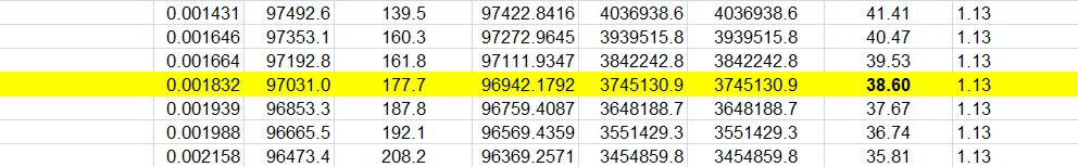
If you enter 1.00 on cell H5 (highlighted), the table on the right is the same as that on the left (there are some trivial differences because of the way that ONS does the calculations). The life expectancy of a 40 year old man is 39.8 years, so the average age of death is 79.8 years. If you enter 1.13 in cell H5, the relative risk of dying (from any cause) for a hamburger per day, the table is recalculated and the life expectancy for a 40 year old man falls to 38.6, so the mean age of death is 78.6 years (these numbers are rounded to 80 and 79 in the summary at the top of this page).
The Excel sheet copies the relative risk that you enter in cell H5 into column O and uses the value in column O to multiply the risk of death in the next year, $ q_x $. So, for example, with a hazard ratio of 1.13, the risk of dying between 40 and 41 is increased from $ q_{40} = 0.00162 $ to $ q_{40} = 0.00162 \times 1.13 = 0.00183 $, and similarly for each year. If you want the relative risk to vary from year to year, you can enter whatever values you want in column O.
Loss of one year from your life expectancy when you are 40 implies loss of about half an hour per day of remaining life: (365 x 24 x 60)/(40 x 365) = 36 minutes per day. This is close to one microlife per day. A microlife is defined as 30 minutes of life expectancy. A man of 22 in the UK has 1,000,000 half-hours (57 years) ahead of him, the same as a 26 year-old woman. David Spiegelhalter explains that loss of one microlife per day is about the same risk as smoking two cigarettes per day. This is put into perspective when you realise that a single chest X-ray will cost you two microlives and a whole-body CT scan (which involves much larger exposure to X-rays) would cost you 180 microlives.
The last way of expressing the risk is perhaps the most surprising. The chance that someone who has a hamburger for lunch every day will die before a similar non-hamburger eater is 53 percent (compared with 50 percent for two similar people). This calculation depends on a beautifully simple mathematical result.
The result can be stated very simply, though its derivation (given by Spiegelhalter here, at the end) needs some maths. The probability that the hamburger eater will life longer than the non-hamburger eater is
\[ \frac{1}{h+1}. \]
When there is no risk, $ h = 1$, this is 0.5, a 50:50 chance of one person dying before the other. When the relative risk (hazard ratio) is $ h = 1.13 $ it is
\[ \frac{1}{1.13+1} = 0.47, \]
so there is a 100 – 47 = 53% chance that hamburger eater dies first.
Another way to put the same result is to say that when a hazard ratio, $ h $, is kept up throughout their lives, the odds that hamburger eater dies before the non-hamburger eater is precisely $ h $. The odds of an event happening are defined as the ratio between the probability of it happening, $ p $, to the probability of it not happening, $ (1-p) $, i.e.
\[ h = \frac {p} {(1-p)}. \]
Rearranging this gives
\[ p = \frac {h} {(1+h)}. \]
When the risk ratio is $ h=1.13 $ this gives $ p = 0.53 $, as before.
Conclusions
Based largely on the fact that the new study shows risks that are smaller than previous, smaller, studies, it seems to me that the evidence for the reality of the association is somewhat weaker than before.
Although the new study, unlike the earlier ones, shows signs for a relationship between the amount of read meat eaten and risk of death, the confounding factors (total calories eaten, weight, smoking etc) are so strong that the evidence for causality is critically dependent on the accuracy of the corrections for these factors, and even more dependent on their not being another factor that has not been included.
It can’t be said too often that if the association is not causal then refraining from eating red meat won’t have the slightest benefit. If it were, for example, the high calorie intake rather than eating meat that causes the risk, then stopping eating meat won’t help you in the slightest.
Even if the increased risk was entirely caused by eating meat, the worst consequence of eating red meat every day is to have a 53% chance of dying before someone who doesn’t eat much meat, rather than a 50% chance.
I won’t become a vegetarian just yet (or, at least if I do it will be on ethical grounds, not because of health risk).
Acknowledgment. I’m very grateful to Professor David Spiegelhalter for help and discussions about this post.
I have in the past, taken an occasional interest in the philosophy of science. But in a lifetime doing science, I have hardly ever heard a scientist mention the subject. It is, on the whole, a subject that is of interest only to philosophers.
|
It’s true that some philosophers have had interesting things to say about the nature of inductive inference, but during the 20th century the real advances in that area came from statisticians, not from philosophers. So I long since decided that it would be more profitable to spend my time trying to understand R.A Fisher, rather than read even Karl Popper. It is harder work to do that, but it seemed the way to go.
|
 |
This post is based on the last part of chapter titled “In Praise of Randomisation. The importance of causality in medicine and its subversion by philosophers of science“. A talk was given at the meeting at the British Academy in December 2007, and the book will be launched on November 28th 2011 (good job it wasn’t essential for my CV with delays like that). The book is published by OUP for the British Academy, under the title Evidence, Inference and Enquiry (edited by Philip Dawid, William Twining, and Mimi Vasilaki, 504 pages, £85.00). The bulk of my contribution has already appeared here, in May 2009, under the heading Diet and health. What can you believe: or does bacon kill you?. It is one of the posts that has given me the most satisfaction, if only because Ben Goldacre seemed to like it, and he has done more than anyone to explain the critical importance of randomisation for assessing treatments and for assessing social interventions.
Having long since decided that it was Fisher, rather than philosophers, who had the answers to my questions, why bother to write about philosophers at all? It was precipitated by joining the London Evidence Group. Through that group I became aware that there is a group of philosophers of science who could, if anyone took any notice of them, do real harm to research. It seems surprising that the value of randomisation should still be disputed at this stage, and of course it is not disputed by anybody in the business. It was thoroughly established after the start of small sample statistics at the beginning of the 20th century. Fisher’s work on randomisation and the likelihood principle put inference on a firm footing by the mid-1930s. His popular book, The Design of Experiments made the importance of randomisation clear to a wide audience, partly via his famous example of the lady tasting tea. The development of randomisation tests made it transparently clear (perhaps I should do a blog post on their beauty). By the 1950s. the message got through to medicine, in large part through Austin Bradford Hill.
Despite this, there is a body of philosophers who dispute it. And of course it is disputed by almost all practitioners of alternative medicine (because their treatments usually fail the tests). Here are some examples.
“Why there’s no cause to randomise” is the rather surprising title of a report by Worrall (2004; see also Worral, 2010), from the London School of Economics. The conclusion of this paper is
“don’t believe the bad press that ‘observational studies’ or ‘historically controlled trials’ get – so long as they are properly done (that is, serious thought has gone in to the possibility of alternative explanations of the outcome), then there is no reason to think of them as any less compelling than an RCT.”
In my view this conclusion is seriously, and dangerously, wrong –it ignores the enormous difficulty of getting evidence for causality in real life, and it ignores the fact that historically controlled trials have very often given misleading results in the past, as illustrated by the diet problem.. Worrall’s fellow philosopher, Nancy Cartwright (Are RCTs the Gold Standard?, 2007), has made arguments that in some ways resemble those of Worrall.
Many words are spent on defining causality but, at least in the clinical setting the meaning is perfectly simple. If the association between eating bacon and colorectal cancer is causal then if you stop eating bacon you’ll reduce the risk of cancer. If the relationship is not causal then if you stop eating bacon it won’t help at all. No amount of Worrall’s “serious thought” will substitute for the real evidence for causality that can come only from an RCT: Worrall seems to claim that sufficient brain power can fill in missing bits of information. It can’t. I’m reminded inexorably of the definition of “Clinical experience. Making the same mistakes with increasing confidence over an impressive number of years.” In Michael O’Donnell’s A Sceptic’s Medical Dictionary.
At the other philosophical extreme, there are still a few remnants of post-modernist rhetoric to be found in obscure corners of the literature. Two extreme examples are the papers by Holmes et al. and by Christine Barry. Apart from the fact that they weren’t spoofs, both of these papers bear a close resemblance to Alan Sokal’s famous spoof paper, Transgressing the boundaries: towards a transformative hermeneutics of quantum gravity (Sokal, 1996). The acceptance of this spoof by a journal, Social Text, and the subsequent book, Intellectual Impostures, by Sokal & Bricmont (Sokal & Bricmont, 1998), exposed the astonishing intellectual fraud if postmodernism (for those for whom it was not already obvious). A couple of quotations will serve to give a taste of the amazing material that can appear in peer-reviewed journals. Barry (2006) wrote
“I wish to problematise the call from within biomedicine for more evidence of alternative medicine’s effectiveness via the medium of the randomised clinical trial (RCT).”
“Ethnographic research in alternative medicine is coming to be used politically as a challenge to the hegemony of a scientific biomedical construction of evidence.”
“The science of biomedicine was perceived as old fashioned and rejected in favour of the quantum and chaos theories of modern physics.”
“In this paper, I have deconstructed the powerful notion of evidence within biomedicine, . . .”
The aim of this paper, in my view, is not obtain some subtle insight into the process of inference but to try to give some credibility to snake-oil salesmen who peddle quack cures. The latter at least make their unjustified claims in plain English.
The similar paper by Holmes, Murray, Perron & Rail (Holmes et al., 2006) is even more bizarre.
“Objective The philosophical work of Deleuze and Guattari proves to be useful in showing how health sciences are colonised (territorialised) by an all-encompassing scientific research paradigm “that of post-positivism ” but also and foremost in showing the process by which a dominant ideology comes to exclude alternative forms of knowledge, therefore acting as a fascist structure. “,
It uses the word fascism, or some derivative thereof, 26 times. And Holmes, Perron & Rail (Murray et al., 2007)) end a similar tirade with
“We shall continue to transgress the diktats of State Science.”
It may be asked why it is even worth spending time on these remnants of the utterly discredited postmodernist movement. One reason is that rather less extreme examples of similar thinking still exist in some philosophical circles.
Take, for example, the views expressed papers such as Miles, Polychronis and Grey (2006), Miles & Loughlin (2006), Miles, Loughlin & Polychronis (Miles et al., 2007) and Loughlin (2007).. These papers form part of the authors’ campaign against evidence-based medicine, which they seem to regard as some sort of ideological crusade, or government conspiracy. Bizarrely they seem to think that evidence-based medicine has something in common with the managerial culture that has been the bane of not only medicine but of almost every occupation (and which is noted particularly for its disregard for evidence). Although couched in the sort of pretentious language favoured by postmodernists, in fact it ends up defending the most simple-minded forms of quackery. Unlike Barry (2006), they don’t mention alternative medicine explicitly, but the agenda is clear from their attacks on Ben Goldacre. For example, Miles, Loughlin & Polychronis (Miles et al., 2007) say this.
“Loughlin identifies Goldacre [2006] as a particularly luminous example of a commentator who is able not only to combine audacity with outrage, but who in a very real way succeeds in manufacturing a sense of having been personally offended by the article in question. Such moralistic posturing acts as a defence mechanism to protect cherished assumptions from rational scrutiny and indeed to enable adherents to appropriate the ‘moral high ground’, as well as the language of ‘reason’ and ‘science’ as the exclusive property of their own favoured approaches. Loughlin brings out the Orwellian nature of this manoeuvre and identifies a significant implication.”
If Goldacre and others really are engaged in posturing then their primary offence, at least according to the Sartrean perspective adopted by Murray et al. is not primarily intellectual, but rather it is moral. Far from there being a moral requirement to ‘bend a knee’ at the EBM altar, to do so is to violate one’s primary duty as an autonomous being.”
This ferocious attack seems to have been triggered because Goldacre has explained in simple words what constitutes evidence and what doesn’t. He has explained in a simple way how to do a proper randomised controlled trial of homeopathy. And he he dismantled a fraudulent Qlink pendant, purported to shield you from electromagnetic radiation but which turned out to have no functional components (Goldacre, 2007). This is described as being “Orwellian”, a description that seems to me to be downright bizarre.
In fact, when faced with real-life examples of what happens when you ignore evidence, those who write theoretical papers that are critical about evidence-based medicine may behave perfectly sensibly. Although Andrew Miles edits a journal, (Journal of Evaluation in Clinical Practice), that has been critical of EBM for years. Yet when faced with a course in alternative medicine run by people who can only be described as quacks, he rapidly shut down the course (A full account has appeared on this blog).
It is hard to decide whether the language used in these papers is Marxist or neoconservative libertarian. Whatever it is, it clearly isn’t science. It may seem odd that postmodernists (who believe nothing) end up as allies of quacks (who’ll believe anything). The relationship has been explained with customary clarity by Alan Sokal, in his essay Pseudoscience and Postmodernism: Antagonists or Fellow-Travelers? (Sokal, 2006).
Conclusions
Of course RCTs are not the only way to get knowledge. Often they have not been done, and sometimes it is hard to imagine how they could be done (though not nearly as often as some people would like to say).
It is true that RCTs tell you only about an average effect in a large population. But the same is true of observational epidemiology. That limitation is nothing to do with randomisation, it is a result of the crude and inadequate way in which diseases are classified (as discussed above). It is also true that randomisation doesn’t guarantee lack of bias in an individual case, but only in the long run. But it is the best that can be done. The fact remains that randomization is the only way to be sure of causality, and making mistakes about causality can harm patients, as it did in the case of HRT.
Raymond Tallis (1999), in his review of Sokal & Bricmont, summed it up nicely
“Academics intending to continue as postmodern theorists in the interdisciplinary humanities after S & B should first read Intellectual Impostures and ask themselves whether adding to the quantity of confusion and untruth in the world is a good use of the gift of life or an ethical way to earn a living. After S & B, they may feel less comfortable with the glamorous life that can be forged in the wake of the founding charlatans of postmodern Theory. Alternatively, they might follow my friend Roger into estate agency — though they should check out in advance that they are up to the moral rigours of such a profession.”
The conclusions that I have drawn were obvious to people in the business a half a century ago. (Doll & Peto, 1980) said
“If we are to recognize those important yet moderate real advances in therapy which can save thousands of lives, then we need more large randomised trials than at present, not fewer. Until we have them treatment of future patients will continue to be determined by unreliable evidence.”
The towering figures are R.A. Fisher, and his followers who developed the ideas of randomisation and maximum likelihood estimation. In the medical area, Bradford Hill, Archie Cochrane, Iain Chalmers had the important ideas worked out a long time ago.
In contrast, philosophers like Worral, Cartwright, Holmes, Barry, Loughlin and Polychronis seem to me to make no contribution to the accumulation of useful knowledge, and in some cases to hinder it. It’s true that the harm they do is limited, but that is because they talk largely to each other. Very few working scientists are even aware of their existence. Perhaps that is just as well.
References
Cartwright N (2007). Are RCTs the Gold Standard? Biosocieties (2007), 2: 11-20
Colquhoun, D (2010) University of Buckingham does the right thing. The Faculty of Integrated Medicine has been fired. https://www.dcscience.net/?p=2881
Miles A & Loughlin M (2006). Continuing the evidence-based health care debate in 2006. The progress and price of EBM. J Eval Clin Pract 12, 385-398.
Miles A, Loughlin M, & Polychronis A (2007). Medicine and evidence: knowledge and action in clinical practice. J Eval Clin Pract 13, 481-503.
Miles A, Polychronis A, & Grey JE (2006). The evidence-based health care debate – 2006. Where are we now? J Eval Clin Pract 12, 239-247.
Murray SJ, Holmes D, Perron A, & Rail G (2007).
Deconstructing the evidence-based discourse in health sciences: truth, power and fascis. Int J Evid Based Healthc 2006; : 4, 180–186.
Sokal AD (1996). Transgressing the Boundaries: Towards a Transformative Hermeneutics of Quantum Gravity. Social Text 46/47, Science Wars, 217-252.
Sokal AD (2006). Pseudoscience and Postmodernism: Antagonists or Fellow-Travelers? In Archaeological Fantasies, ed. Fagan GG, Routledge,an imprint of Taylor & Francis Books Ltd.
Sokal AD & Bricmont J (1998). Intellectual Impostures, New edition, 2003, Economist Books ed. Profile Books.
Tallis R. (1999) Sokal and Bricmont: Is this the beginning of the end of the dark ages in the humanities?
Worrall J. (2004) Why There’s No Cause to Randomize. Causality: Metaphysics and Methods.Technical Report 24/04 . 2004.
Worrall J (2010). Evidence: philosophy of science meets medicine. J Eval Clin Pract 16, 356-362.
Follow-up
Iain Chalmers has drawn my attention to a some really interesting papers in the James Lind Library
An account of early trials is given by Chalmers I, Dukan E, Podolsky S, Davey Smith G (2011). The adoption of unbiased treatment allocation schedules in clinical trials during the 19th and early 20th centuries. Fisher was not the first person to propose randomised trials, but he is the person who put it on a sound mathematical basis.
Another fascinating paper is Chalmers I (2010). Why the 1948 MRC trial of streptomycin used treatment allocation based on random numbers.
The distinguished statistician, David Cox contributed, Cox DR (2009). Randomization for concealment.
Incidentally, if anyone still thinks there are ethical objections to random allocation, they should read the account of retrolental fibroplasia outbreak in the 1950s, Silverman WA (2003). Personal reflections on lessons learned from randomized trials involving newborn infants, 1951 to 1967.
Chalmers also pointed out that Antony Eagle of Exeter College Oxford had written about Goldacre’s epistemology. He describes himself as a “formal epistemologist”. I fear that his criticisms seem to me to be carping and trivial. Once again, a philosopher has failed to make a contribution to the progress of knowledge.